| Image |
Comment |
| 07/08/2002 04:24:00 PM |
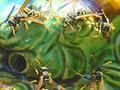
zzzzzzZZZZZZby pauldComment by Kimbly: Neat macro view of the yellowjackets. Not sure about them being cut off though, and also I'm not sure about that background. |
| 07/08/2002 02:22:00 PM |
|
| 07/08/2002 01:01:00 PM |
|
| 07/08/2002 12:59:00 PM |
zzzzzzZZZZZZby pauldComment by kathleenm: Yuck, yuck, yuck!!! Definitely MY worst fear! The top evil creature is a little over exposed, but I wouldn't have wanted to hang around too long to get this shot so it's forgiven...lol. |
| 07/08/2002 09:25:00 AM |
zzzzzzZZZZZZby pauldComment by crisa58: very good macro. what are they crawling on? Tad bright at top, otherwise, very nice |
| 07/07/2002 11:31:00 PM |
Aaaaaahby pauldComment by Froober: I originally voted this pretty low. Sorry, but it grossed me out. Everyone gets a yuck tongue now and then...but if you're gonna have a pic taken of it...brush the darn thing!! Anyway, tongue aside, this is a pretty neat idea. I like how the lens view blocks the subject but also allows you to view the blocked areas...make sense? I would have preferred the out of focus ear support doo-hicky not be in the picture and maybe a nicer background with less hyper-exposure (the blown out white zone under her chin). I'd also consider not having her wearing shades so the glare on her glasses wouldn't mask her expression...I guess that's added transparency in this challenge though. 5 |
| 07/07/2002 05:34:00 PM |
|
| 07/07/2002 03:28:00 PM |
|
| 07/06/2002 08:56:00 PM |
Aaaaaahby pauldComment by stephan: i see the transparency but the shot is not so creative (or i don''t get it). also a bit overexposured, because the white light on the right side "burns" in to the face. |
| 07/04/2002 11:59:00 AM |
Aaaaaahby pauldComment by jmsetzler: This is really neat! Great job on the transparency :) = 8 - jmsetzler |
Home -
Challenges -
Community -
League -
Photos -
Cameras -
Lenses -
Learn -
Help -
Terms of Use -
Privacy -
Top ^
DPChallenge, and website content and design, Copyright © 2001-2026 Challenging Technologies, LLC.
All digital photo copyrights belong to the photographers and may not be used without permission.
Current Server Time: 07/15/2026 07:04:37 PM EDT.