| Image |
Comment |
| 07/27/2006 02:28:54 PM |
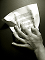
Braking Linesby Gaby_GComment by atupdate: I didn't vote in the Lines II challenge because it was the first challenge I entered and I didn't want to look at my competition critically. I like the b&w conversion of this photo and the overall composition. I agree that this did not deserve the 1s & 2s you received but most entries don't. You might want to consider rotating this image 180 degrees to see if the change in perspective helps the image. As is, it looks like the paper is being pressed against the wall instead of grabbed off a table. |
 Photographer found comment helpful. Photographer found comment helpful. |
| 07/27/2006 02:23:13 PM |
Looking down re-loaded.by Gaby_GComment by atupdate: Although you aren't allowed to do the cloning you did here for a basic challenge, if you would have composed the shot this way originally, I would have given you a 5 or 6 instead of the 4 I gave your challenge photo. Nice PP on this image. I don't think it is over sharpened either. Message edited by author 2006-07-27 14:23:55. |
| Photographer found comment helpful. |
| 07/27/2006 01:28:24 PM |
|
| Photographer found comment helpful. |
| 07/27/2006 05:03:24 AM |
|
| Photographer found comment helpful. |
| 07/27/2006 02:58:31 AM |
|
| Photographer found comment helpful. |
| 07/27/2006 02:42:57 AM |
The goodby Gaby_GComment by Tej: Beautiful. The post-processing on this one really compliments the beauty of the model :) I guess you dodge-burn the photo to highlight the face and it has worked just perfect (without being overdone). The lighting is just right and 'natural' thoughtful expression adds a lot to photo. My only crib (and I guess a very small one) is that I can see jagged edges on the forehead ... did you upload low quality jpeg or is it neatimage? |
| Photographer found comment helpful. |
| 07/26/2006 08:37:22 PM |
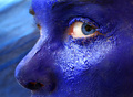
Blue gazeby Gaby_GComment by Matt414ce: Haha, how long did it take your model to get all that off? I love the image, looking back is cool. Great job! Only thing I think would have helped would have been to get a more uniform texture along the nose and a catch-light in the eye. By more uniform along the nose, I mean that it's texture would match what is under the eye. |
| Photographer found comment helpful. |
| 07/26/2006 08:00:52 PM |
|
| Photographer found comment helpful. |
| 07/26/2006 05:41:21 PM |
Braking Linesby Gaby_GComment by accady: I didn’t have the time to vote for this challenge but this surely isn’t a picture to deserve 5 ones and 8 twos. I think it’s quite a great idea. Sometimes it’s really hard for me to understand why people keep voting those sunsets and nice-color-night-shots (sometimes related to a challenge theme only by tile) when there are so many clever pictures to vote for.
Anyway, I really enjoyed the other pics in your Portfolio … nice PS work.
|
| Photographer found comment helpful. |
| 07/26/2006 11:40:36 AM |
Blue gazeby Gaby_GComment by violinist123: Pros: those blue eyes really make the shot. Texture of the paint on the skin really nice. I like the highlight under the eye. Like the dof.
Cons: The little bit of the other eye that is showing, and the eyebrow, detract from the shot. Would like to see all of the main eyebrow, and if you had painted or powdered it a lighter shade of blue as well that really would have sex'd it up. As this was advanced editing, another thing that could really have added some spark would be to either get rid of the veins in the eye or else tint the white part of the eye a light shade of blue as well.
6. |
| Photographer found comment helpful. |
Home -
Challenges -
Community -
League -
Photos -
Cameras -
Lenses -
Learn -
Help -
Terms of Use -
Privacy -
Top ^
DPChallenge, and website content and design, Copyright © 2001-2026 Challenging Technologies, LLC.
All digital photo copyrights belong to the photographers and may not be used without permission.
Current Server Time: 06/21/2026 10:09:40 AM EDT.