| Image |
Comment |
| 08/27/2002 01:07:00 AM |
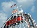
when fear was funby BeeGeeComment by just-married: Nice shot. I wish it were less sky more roller coaster; but to get enough, you might have had to crop out part of Cyclone, which I'd have been reluctant to do. I would be interesting to see how the photo changes if the focus were on the rails as they start to dip instead of the name of the ride. Good title. 6-7, I'll see what I think as the week passes. just-married |
| 08/26/2002 08:42:00 PM |
when fear was funby BeeGeeComment by byetko: I really like the way the flags match the red, white and blue of the coaster and sky. Great use of colors. 7. |
| 08/26/2002 05:47:00 PM |
|
| 08/26/2002 03:40:00 PM |
|
| 08/26/2002 01:51:00 PM |
|
| 08/26/2002 03:08:00 AM |
|
| 08/25/2002 05:04:00 PM |
untitledby BeeGeeComment by johnmk: Nice play with sharpness. The music of the background might have been more interesting. |
| 08/23/2002 10:51:00 PM |
untitledby BeeGeeComment by syamjonimi: Good composition however, DOF is shallow and the picture appears quite grainy. The stark black upper right corner seems a little distracting. All in All this is a worthy of note for the challenge topic. |
| 08/23/2002 09:59:00 PM |
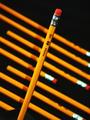
untitledby BeeGeeComment by RedRuthann: REALLY GREAT - I can see the time and effort put into this one. It's simple - but not. I definately like the composition - the usage of lines. The choice of dof is also really great - it makes the primary subject REALLY stand out (isn't that the point of dof?). Great achievement of black background. At first, the extra contrast (if that's what it is) stood out as a negative, but as I really look at it, I think it adds more the photo. GREAT WORK 9 Ruthann |
| 08/23/2002 11:08:00 AM |
untitledby BeeGeeComment by HBunch: Great patterns. I like how the front pencil was placed in opposite of the other pencils. you had very good spacing in the bottom pencils. Lighting is good and focus and angle are good. Sharp focus on the front pencil and soft focus on the others looks really nice in this case. I am curious about the very bottom pencil and why it is cut off at an angle like that. great job and good luck in the challenge. |
Home -
Challenges -
Community -
League -
Photos -
Cameras -
Lenses -
Learn -
Help -
Terms of Use -
Privacy -
Top ^
DPChallenge, and website content and design, Copyright © 2001-2026 Challenging Technologies, LLC.
All digital photo copyrights belong to the photographers and may not be used without permission.
Current Server Time: 07/17/2026 01:45:51 AM EDT.