| Image |
Comment |
| 09/22/2002 09:15:00 PM |
|
| 09/22/2002 03:09:00 AM |
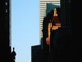
cityscapeby BeeGeeComment by IGJOE: I saw a similar image in this quarter's Photographer's forum magazine. I loved it there and I love yours just as much. |
| 09/21/2002 10:05:00 AM |
cityscapeby BeeGeeComment by Gordon: I think I'd prefer it without the building on the left - great light though - makes me want to see the rest of the buildings so works very well |
| 09/20/2002 03:21:00 PM |
cityscapeby BeeGeeComment by mjcecil: Good attempt at contrasting the modern and the old. The NS in the composition does, in fact, embody the idea appropriately. |
| 09/20/2002 03:12:00 PM |
cityscapeby BeeGeeComment by lightplayer: my biggest criticism is that i see two pictures here, divide the picture vertically right down the middle and you have two nice pictures that both use neg space well |
| 09/20/2002 03:16:00 AM |
|
| 09/19/2002 05:20:00 AM |
|
| 09/18/2002 08:12:00 PM |
|
| 09/18/2002 11:58:00 AM |
cityscapeby BeeGeeComment by Kavey: Nice idea. Because the some buildings are in shadow I'm sort of seeing two competing areas of neg space, the black and the sky - and they aren't merging so it feels unbalanced. I know this is one of my least clear and least helpful comments, apologies. Articulate NOT! 5, Kavey |
| 09/18/2002 07:46:00 AM |
cityscapeby BeeGeeComment by scw1217: A nice cityscape photograph. Usually they need more detail to be good, but your use of negative space adds to this one. |
Home -
Challenges -
Community -
League -
Photos -
Cameras -
Lenses -
Learn -
Help -
Terms of Use -
Privacy -
Top ^
DPChallenge, and website content and design, Copyright © 2001-2026 Challenging Technologies, LLC.
All digital photo copyrights belong to the photographers and may not be used without permission.
Current Server Time: 07/16/2026 04:33:42 PM EDT.