| Image |
Comment |
| 05/19/2004 02:22:39 PM |
|
 Photographer found comment helpful. Photographer found comment helpful. |
| 05/19/2004 01:51:23 PM |
|
| Photographer found comment helpful. |
| 05/19/2004 10:06:07 AM |
|
| Photographer found comment helpful. |
| 05/19/2004 07:06:40 AM |
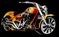
Center of Attentionby jmleliiComment by coolhar: a very nice, impactful shot but the background is much too dark, it takes away definition by blending with the black parts of the subject (tires and seat) |
| Photographer found comment helpful. |
| 05/18/2004 09:05:31 PM |
Center of Attentionby jmleliiComment by doctornick: NIce but the streaks on the top left and bottom left are distracting. This being an advanced editing rule challange, removing the streaks is allowed. Nice capture otherwise. I like how you made the background black to bring out the bike. |
| Photographer found comment helpful. |
| 05/18/2004 06:56:42 PM |
Center of Attentionby jmleliiComment by Pedro: nice ride. simple composition, and you managed to keep the chrome from blowing out everywhere - that's a chore. well done. P |
| Photographer found comment helpful. |
| 05/17/2004 09:23:57 PM |
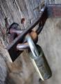
Timeworn...by jmleliiComment by admart01: Hi Jeremy,
Greetings from the Critique Club...
Congrats on a new personal best with this shot.
You have composed an interesting shot here. You've used dof very well to isolate your main subjects against a pleasantly blurred background. I also like how the top part of the hinge is oof and the part connected to the lock is crisp. I helps pull my eye through the shot as does the angle of the elements.
I agree that the hot spot detracts a bit.
The blues and grays make a subtle color statement that completes the overall effect.
To make it a bit better? I think playing around with the location and angle of the light might add some punch to the rust tones and bring out some interesting shadows without interfering with your existing colors. The flat lighting, while effective, doesn't add depth or interest.
I hope you found my comments helpful. Please pm me if you have questions.
Regards,
Theresa |
| Photographer found comment helpful. |
| 05/17/2004 12:56:47 AM |
|
| Photographer found comment helpful. |
| 05/12/2004 11:54:41 AM |
|
| 05/11/2004 03:36:50 PM |
Timeworn...by jmleliiComment by Nelzie: I find it interesting how the focus drops away from the top to the bottom of the image.
Is that you reflected in the shiny metal of the lock? That bit is slightly distracting. I am unsure how you would 'fix' that in future shots. Perhaps someone with better knowledge could answer that... |
| Photographer found comment helpful. |
Home -
Challenges -
Community -
League -
Photos -
Cameras -
Lenses -
Learn -
Help -
Terms of Use -
Privacy -
Top ^
DPChallenge, and website content and design, Copyright © 2001-2026 Challenging Technologies, LLC.
All digital photo copyrights belong to the photographers and may not be used without permission.
Current Server Time: 07/16/2026 12:44:52 PM EDT.