| Image |
Comment |
| 06/27/2004 10:33:44 AM |
Loungin' Aroundby jmleliiComment by blindjustice: THis is very very well thought out, composed adn finished. I like the contrast of the whites in the desat and the black and white. The only distraction is that the subject is a bit busy and mundane, my eyes are drawn to 3 places- the two garbage cans and the umbrella that is black and white. |
 Photographer found comment helpful. Photographer found comment helpful. |
| 06/27/2004 09:43:18 AM |
|
| Photographer found comment helpful. |
| 06/26/2004 03:48:36 PM |
|
| Photographer found comment helpful. |
| 06/26/2004 03:07:39 PM |
|
| Photographer found comment helpful. |
| 06/26/2004 01:08:45 PM |
|
| Photographer found comment helpful. |
| 06/26/2004 12:41:50 PM |
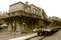
Historic Bethlehemby jmleliiComment by admart01: Hi Jeremy,
Greetings from the Critique Club...
This is the second entry of yours I've had the pleasure to study and comment on.
I agree with your other commenters -- the sepia tones (and the absence of any elements that would give away the year) has this feeling like an old photo.
I think your photo suffered a bit from the "train" being more of a distracting rather than enhancing element - it's not very photogenic or interesting as presented. While it's a technically good shot it doesn't have a particularly strong composition -- more of a documentary/journalistic feel. (I can see it printed and displayed in the local luncheonette as a representation of a time gone by.)
Please PM me if you have any questions or comments.
Regards, (from nearby Yardley)
Theresa |
| Photographer found comment helpful. |
| 06/26/2004 04:21:00 AM |
|
| Photographer found comment helpful. |
| 06/25/2004 02:35:51 AM |
Loungin' Aroundby jmleliiComment by Gringo: Excellent Entry! This is fun for the eye to browse around all the action. Clean, clear detail and the umbrellas bring flavor to the scene. My only thought on how I might improve on this would be to take a look at how bright the shirt is on the guy at the bottom right. I might try to tone his shirt down to blend with the rest of the people. I like this. 9 |
| Photographer found comment helpful. |
| 06/25/2004 01:48:49 AM |
Thome Homers, Phils Win!by jmleliiComment by AmiYuy: This goes in order of what I notice first:
1) Boost the colors a bit by adjusting the contrast, it seems really dull, although I know paper photos can be, they don't have to be.
2) Rotate a bit to make the line of the box parallel to the bottom edge, it just seems like he's ready to fall backwards.
Score: 5 |
| Photographer found comment helpful. |
| 06/24/2004 11:56:28 PM |
|
| Photographer found comment helpful. |
Home -
Challenges -
Community -
League -
Photos -
Cameras -
Lenses -
Learn -
Help -
Terms of Use -
Privacy -
Top ^
DPChallenge, and website content and design, Copyright © 2001-2026 Challenging Technologies, LLC.
All digital photo copyrights belong to the photographers and may not be used without permission.
Current Server Time: 07/16/2026 11:54:07 PM EDT.