| Image |
Comment |
| 04/13/2005 05:05:50 PM |
|
| 04/13/2005 04:28:39 PM |
|
| 04/13/2005 03:55:25 PM |
|
| 04/13/2005 02:28:57 PM |
|
 Photographer found comment helpful. Photographer found comment helpful. |
| 04/13/2005 02:22:05 PM |
|
| Photographer found comment helpful. |
| 04/13/2005 02:09:47 PM |
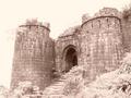
The Lost Grandeurby kghoshalComment by dahkota: I think you located this shot perfectly. The viewer is 'led up the stairs into the door. I really like the image but wish it was either a little darker or in black and white instead of sepia. Sky looks a little blown out. 7 |
| Photographer found comment helpful. |
| 04/13/2005 12:56:09 PM |
|
| 04/13/2005 12:52:55 PM |
|
| 04/13/2005 12:12:30 PM |
The Lost Grandeurby kghoshalComment by tommyd65: Nice castle, but the photo seems a bit washed out to me (not sure if this was done on purpose). The top left side takes away from the rest of the picture. |
| 04/13/2005 09:35:45 AM |
|
Home -
Challenges -
Community -
League -
Photos -
Cameras -
Lenses -
Learn -
Help -
Terms of Use -
Privacy -
Top ^
DPChallenge, and website content and design, Copyright © 2001-2026 Challenging Technologies, LLC.
All digital photo copyrights belong to the photographers and may not be used without permission.
Current Server Time: 07/15/2026 05:30:31 PM EDT.