| Image |
Comment |
| 09/18/2002 12:05:00 AM |
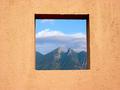
Framedby lmhrComment by indigo997: Don't you hate it when you have a great idea and someone else has the same one? This is just excellent tho. Nice colors & beautiful view. Light seems a bit harsh maybe. 9 ~indigo997 |
| 09/17/2002 10:49:00 PM |
Framedby lmhrComment by zadore: Awesome use of NS...this shot kicks but. I wish there was a bit more contrast in the middle...but it's still a 9 - zadore |
| 09/17/2002 04:14:00 PM |
Framedby lmhrComment by Zeissman: I like this image, it looks like a SW scene, maybe NM? I am not sure that it really meat the challenge though. Negative space is something that compliments and accentuates the subejct. These subjects are competitng for my attention. You have a very nice photo, worthy of display, and I will vote it as such. For ways to improve this specific image: Maybe a UV/Haze filter, or a polarizing filter would bring out the mountains a little more. Good eye for a great subject. |
| 09/17/2002 03:23:00 PM |
Framedby lmhrComment by DougPaz: Top 5 this week! I love the texture of your "frame" and the backdrop is beautiful! |
| 09/17/2002 08:57:00 AM |
Framedby lmhrComment by mjcecil: Pretty freakin' good. I would have centered the camera with respect to the window to even out the interior perspective of the window itself. |
| 09/17/2002 04:49:00 AM |
Framedby lmhrComment by rocco22: haha this is the same thing that i was going to do but only with a paper that I just cut the window in. This is much better. I'm glad that i didn´t post this week. great jop and extra point for having the same idie. -rocco22- |
| 09/17/2002 02:10:00 AM |
Framedby lmhrComment by sulamk: Composition: Lovely 6 Lighting: good6, Appeal:8, Total Rating8 Sulamk |
| 09/16/2002 11:37:00 PM |
|
| 09/16/2002 10:02:00 PM |
Framedby lmhrComment by Gene L.: Nicely done! I love the colors and the dynamics created by the shift from the simple smooth texture of the wall to the grand, rough texture of the mountains. |
| 09/16/2002 07:08:00 PM |
Framedby lmhrComment by studio1graphics: While many of the entries this week were good photography, few actually really understood the assignment of negative space. You clearly understood and did an excellent job of portraying it. Good job! |
Home -
Challenges -
Community -
League -
Photos -
Cameras -
Lenses -
Learn -
Help -
Terms of Use -
Privacy -
Top ^
DPChallenge, and website content and design, Copyright © 2001-2026 Challenging Technologies, LLC.
All digital photo copyrights belong to the photographers and may not be used without permission.
Current Server Time: 06/11/2026 08:05:29 PM EDT.