| Image |
Comment |
| 09/21/2002 10:34:00 PM |
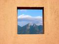
Framedby lmhrComment by miller: Nice shot, but I think it would look better if it was well-centered. |
| 09/21/2002 10:31:00 PM |
Framedby lmhrComment by jmattys: I am drawn to this photo because of the stucco framing. I would like to see the mountains in better focus. 7 |
| 09/21/2002 10:53:00 AM |
Framedby lmhrComment by Gordon: like it - could do with being even more 'straight on' but a good effect. |
| 09/21/2002 10:36:00 AM |
Framedby lmhrComment by Kavey: Well framed, though the wall isn't very striking and I think it's colour detracts from the view within. 6, Kavey |
| 09/20/2002 03:47:00 PM |
Framedby lmhrComment by Gracious: Very nice job. I love the use of color and texture here, while meeting the challenge. Good luck in the current challenge! Grayce aka Gracious |
| 09/20/2002 02:59:00 PM |
Framedby lmhrComment by jkiolbasa: Neat photo. Well done tratment of the "Framing with neg space" concept. |
| 09/20/2002 02:46:00 PM |
|
| 09/20/2002 10:18:00 AM |
Framedby lmhrComment by waltoml: This is a great picture. You have done a great job of using negative space. Lighting and focus are good. Your subject matter is great... (3 greats in one comment... Wow....) waltoml 9 |
| 09/20/2002 04:58:00 AM |
Framedby lmhrComment by GeneralE: Be wary of over-sharpening a photo like this. The significant color differences between the frame and contents can create a "halo" effect and make it look like a composited image... |
| 09/20/2002 01:39:00 AM |
|
Home -
Challenges -
Community -
League -
Photos -
Cameras -
Lenses -
Learn -
Help -
Terms of Use -
Privacy -
Top ^
DPChallenge, and website content and design, Copyright © 2001-2026 Challenging Technologies, LLC.
All digital photo copyrights belong to the photographers and may not be used without permission.
Current Server Time: 06/11/2026 04:50:08 PM EDT.