|
|
|
Showing 951 - 960 of ~1480 |
| Image |
Comment |
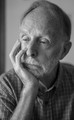
| 09/09/2015 05:55:23 AM | Lost in thoughtby clickodakComment by sidpixel: *Hello from Sid and the Critique Club*
An interesting image that meets the challenge indirectly.
I quite like the fact that you have approached the challenge from a not so obvious perspective with the hand as a secondary inclusion. However, from the point of view of the challenge this is probably not as effective as giving the hand more a prominent role. As I was initially looking at this I was ruminating my thoughts and I instinctively adopted a posture with my fingers in front of my mouth and the back of my hand and probably a frown would have been prominent in any image that might have been taken of me. I think such a pose would have conveyed your intentions much better. The gentleman here, to be honest, looks as though he's about to doze off!
The DOF is very shallow here to the extent that you don't have both eyes in focus which is not always necessary but here you are wanting to get into the mans head and two doorways are better than one. The composition is just about ok but feeling just a little on the tight side, the darker stripe in the left background doesn't add to the image and should therefore have been excluded, a plain wall would have been better. The window lighting is good with a nice variation from bright to dark without any excess and retaining good detail.
Your commenter got the message! Thank you for a competent entry Marcel. |  Photographer found comment helpful. Photographer found comment helpful. |
| 09/08/2015 07:23:09 AM | Backhand Powerby clickodakComment by sidpixel: *Hello from Sid and the Critique Club*
An action shot that contributes well to the open challenge.
Well captured Marcel, a very dynamic image that freezes the action mid stroke. I particularly like his shadows, there are some bold colours throughout. You've got good sharp focus on the player himself and the determined effort he is making with a nice shallow DOF separating him from the background.
Your composition is good with him on the left of the frame powering into the empty right. What would give the shot more impact would be to have the speeding ball in the right of the frame. Timing wise again the shot would have more impact if the racket didn't coincide with the apparatus in the background.
Generally, a good shot Marcel, well done, Sid | | Photographer found comment helpful. |
| 09/07/2015 09:13:18 PM | | | Photographer found comment helpful. |
| 09/07/2015 08:20:17 PM | | | Photographer found comment helpful. |
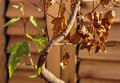
| 09/07/2015 07:03:05 AM | Autumn camouflageby clickodakComment by sidpixel: *Hello from Sid and the Critique Club*
A straightforward image that fails to meet the challenge.
I think I can understand your thinking behind the concept for this image but a successful entry needs to convey its meaning much more readily through the image itself and the title. Your entry requires the voter to get inside your head and given that they don't have your comments for guidance this is a big ask.
As regards the image itself, the lighting is a little harsh with some blown highlights on the backlit leaves. The black debris at the base of the trunk does not help in conveying a natural scene but it is not a major element. I think this would have more impact if you had adopted a ground level view that emphasised the leaves and their colour with the base of the trunk in distant soft focus. I'm sorry to say, it is just not an interesting enough image to keep the viewer's attention.
Anyway, thanks for your entry Marcel and apologies for the delayed critique, as they say, 'better late than never', or at least I hope it is, Sid. | | Photographer found comment helpful. |
| 09/07/2015 06:08:28 AM | Every Ending contains a new Beginning (I. Ching)by clickodakComment by sidpixel: *Hello from Sid and the Critique Club*
An appealing image that meets the challenge.
I like your interpretation and title, it works well, you have achieved your goal, certainly for me anyway. The branch you have found here is a very interesting shape with all of the dead leaves to the right and the one thriving shoot to the left, you have composed it well with a close crop that is just about right for the subject.
I find the OOF dead leaf in the foreground a little distracting but not in a major way, in any case I think as long as you have all of the living side in good sharp focus the right matters less. I think a little less DOF could have improved it further reducing the background detail as long as the living side can be kept sharp. A plain cloth or card would have been good here. The lighting is perhaps a little on the harsh side but you have controlled the exposure quite well.
Nicely done Marcel, thanks for your submission, Sid | | Photographer found comment helpful. |
| 09/06/2015 11:42:16 PM | | | Photographer found comment helpful. |
| 09/06/2015 07:20:13 AM | No body todayby clickodakComment by sidpixel: *Hello from Sid and the Critique Club*
An original take the fulfils the challenge theme.
Well spotted for the challenge theme, I agree with one of your commenters, I like the shadows too and just wish they had been stronger. As regards the composition, I like that you have it on a slant the way you have but I think you missed an opportunity to make more from it. I would have composed it so that the ends of the wood weren't visible thereby creating the illusion that this was an endlessly long array of coathooks. I would also have made more of the diagonal and the shadows by a closer position to the wood and the hooks that exaggerates their perspective.
Just one point that would probably be considered pedantic but to me rather important, your title if read the way it is written suggests that there have been no dead bodies hung up to dry today!
Anyway, thanks for your submission and apologies for the delayed critique, as they say, 'better late than never', or at least I hope it is, Sid. Please feel free to reciprocate on any of my images, I would welcome your feedback… | | Photographer found comment helpful. |
| 09/05/2015 07:43:09 AM | Guitar curveby clickodakComment by sidpixel: *Hello from Sid and the Critique Club*
An appealing image that partially meets the challenge.
This is more a close up than a macro but it is certainly inanimate. You've made a lovely job of this Marcel, the black backgrounds work well to isolate the detail of the guitar. That same detail is unfortunately part of the problem in that the worn areas of the instrument are quite prominent, I think for this sort of image to work at its best it needs to be a new or an absolutely pristine guitar.
I like your composition with the three strings on the right leaving sufficient room for a balanced background on the left. Given you comments there is also the possibility for a vertical composition just up to the outer edge of the sound hole embellishments, in that way the top curve could be included and our attention would be concentrated purely on the classic curved shapes ithemselves against the black. I think the simplicity of such a composition would have had more impact.
Nicely done, thanks for your submission and apologies for the delayed critique, as they say, 'better late than never', or at least I hope it is, Sid | | Photographer found comment helpful. |
| 09/04/2015 01:19:37 PM | | | Photographer found comment helpful. |
|
Showing 951 - 960 of ~1480 |
Home -
Challenges -
Community -
League -
Photos -
Cameras -
Lenses -
Learn -
Help -
Terms of Use -
Privacy -
Top ^
DPChallenge, and website content and design, Copyright © 2001-2026 Challenging Technologies, LLC.
All digital photo copyrights belong to the photographers and may not be used without permission.
Current Server Time: 07/19/2026 08:17:41 AM EDT.
|