| Image |
Comment |
| 09/30/2015 04:28:39 PM |
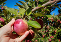
Apple Picking in Fallby clickodakComment by sidpixel: *Hello from Sid and the critique club*
An appealing image that meets the challenge.
Your composition is very good, I like the way you have gone in close with good DOF on the apple and the hand together with the soft focus background of the abundant apple crop. It tells us that the apple is ripe and ready for picking which identifies it with the Northern hemisphere's season. The empty patch of blue sky is a little dominating and would probably benefit from some cropping. The exposure is good and the colours and detail look good too.
All in all, a very good submission Marcel, its a shame it didn't get any comments during the challenge, I hope this makes up for it, Sid |
 Photographer found comment helpful. Photographer found comment helpful. |
| 09/30/2015 11:39:46 AM |
|
| Photographer found comment helpful. |
| 09/30/2015 10:30:03 AM |
|
| Photographer found comment helpful. |
| 09/28/2015 06:00:32 PM |
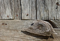
Wear and Tear of timeby clickodakComment by sidpixel: *Hello from Sid and the critique club*
An appealing image that meets the challenge
A good choice of subject that displays the ravages of the elements the wood has endured over the years, your composition is good with the nailed knot of wood placed in its most obvious and effective position on the lower left thirds hotspot, it works well. The most obvious problem with it is the time of day it was taken it has been taken under strong overhead sunlight which is not the best choice especially to bring out the textures and characteristics of the aged wood. Under better light this would have a lot more impact.
I like that you have observed beyond the structure of the building and gone for more of an abstract approach that isolates the wood and nails with an interesting section such as you have, well done Marcel. |
| Photographer found comment helpful. |
| 09/27/2015 11:57:11 PM |
|
| Photographer found comment helpful. |
| 09/27/2015 11:40:59 PM |
|
| Photographer found comment helpful. |
| 09/23/2015 07:27:12 AM |
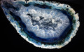
Foetus of a rockby clickodakComment by sidpixel: *Hello from Sid and the Critique club*
An appealing image that does not meet the challenge.
The rock is very appealing in its own right but in order to meet the challenge there should be nothing but rock, ie., no background at all. I can see your reasoning, the rock is certainly womb-like more than foetus like but this is the wrong challenge to use this in because you need to see the whole to understand your concept but to fulfil this challenge brief you need to crop significantly in order to fill the frame.
The lighting is uniform and illuminates the rock well and DOF is good though I wonder if you needed to use quite so small an aperture, perhaps f8 or f11 would have sufficed.
Sorry you didn't get any comments during the challenge, I hope this helps. Thanks for your submission, Sid |
| Photographer found comment helpful. |
| 09/11/2015 05:57:24 PM |
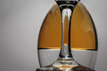
Upside Downby clickodakComment by sidpixel: *Hello from Sid and the Critique Club*
An interesting image that meets the challenge well.
I like your originality here Marcel, there's no doubting its conformity to the challenge brief, well done. Glass is a wonderful medium to work with but it does not come without its significant problems, mostly reflections and that unfortunately is where great attention to detail is needed and is a little lacking in your image. In particular the specular highlights from your lighting that form distinctive white blobs of blown highlights are the worst followed closely by those of yourself and your camera. It is not easy to get this right and some post processing is often inevitably required to perfect the end result. Another fundamental that lets your image down is that there is distinct tilt to the right.
Anyway, I commend you for a brave and original attempt, Sid |
| Photographer found comment helpful. |
| 09/10/2015 06:31:11 AM |
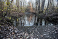
Looked simple on autumnby clickodakComment by sidpixel: *Hello from Sid and the Critique Club*
A grab shot that does not meet the challenge.
This feels as it sounds like an impromptu shot that has not had sufficient thought or preparation beforehand, although I think I understand your emotion behind it it does not suggest simplicity at all. There is too much that is competing for attention which is quite the opposite of what I should be getting if this were truly simplistic.
A much more simplistic approach would have been to focus on just one or two elements as opposed to the bridge, water, reflections, trees, leaves and sky that we have here, there is just far too much.
I'm sorry Marcel but this was definitely not one of your better ones, Sid |
| Photographer found comment helpful. |
| 09/09/2015 06:28:38 AM |
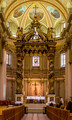
Mary, Queen of the World Cathedralby clickodakComment by sidpixel: *Hello from Sid and the Critique Club*
An impressive image that meets the challenge fully.
This is certainly a very colourful image of an elaborately adorned location of worship that undoubtedly fulfils the challenge. For this sort of image to work at its very best it needs absolutely perfect symmetry and although you have got very close to that goal it is not quite there. You are just a fraction too far over to the right, although its very marginal it is noticeable to anyone who would look closely enough, but fortunately that is probably not the case for the majority of your viewers here. I can't quite be sure but there also feels a very slight tilt to the right.
You have done well to control the exposure the way you have, its good. I think your aperture is probably smaller than you actually needed, assuming you are at the 24mm end you would have a larger DOF anyway and I think you may have managed with f8, certainly f11 which have given you about 1s+ shutter speed which would have sharpened your moving person much better and made him less distracting. You do, of course, have plenty of scope with your ISO too which even at 400 would have eliminated any movement completely.
Nicely done, thanks for your submission and apologies for the delayed critique, as they say, 'better late than never', or at least I hope it is, Sid |
| Photographer found comment helpful. |
Home -
Challenges -
Community -
League -
Photos -
Cameras -
Lenses -
Learn -
Help -
Terms of Use -
Privacy -
Top ^
DPChallenge, and website content and design, Copyright © 2001-2026 Challenging Technologies, LLC.
All digital photo copyrights belong to the photographers and may not be used without permission.
Current Server Time: 07/19/2026 08:17:45 AM EDT.