| Image |
Comment |
| 03/15/2016 10:17:19 PM |
|
 Photographer found comment helpful. Photographer found comment helpful. |
| 03/14/2016 01:08:19 PM |
|
| Photographer found comment helpful. |
| 03/09/2016 09:11:57 AM |
|
| 03/08/2016 07:44:49 PM |
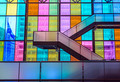
Stairs Colored Through Windowsby clickodakComment by snaffles: Greetings from the Critique Club!
Dang, Marcel, I can see exactly what you had in mind, and I think this image is way underrated...I gave you an 8 on it. If this were a challenge for Windows, as opposed to Window Light, or even Architecture, this could have done really well. Very simple, dynamic comp with leading lines taking you up out of frame, to who knows where?
A suggestion: crop out the frames on the left, from the one with the flag on, and if you have time, add a person or two on the staircase and see how much stronger this image would be. Mark this location as one to use for future shoots!
Susan |
| Photographer found comment helpful. |
| 03/08/2016 06:13:14 PM |
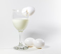
Power Shakeby clickodakComment by snaffles: Greetings from the Critique Club!
Hehe, thanks for the shout-out Marcel:-) And of course I end up with your image to critique! Yes the comp is simple, and technically it's pretty good, though you want to try and light from both sides when doing a shot like this, to create that nice flawless white bg. The eggs and glass are a little close to the bg, you want more distance away from the backdrop so you don't get a shadow.
Keep up the good work, you're doing well!
Susan |
| Photographer found comment helpful. |
| 03/06/2016 10:59:08 PM |
|
| Photographer found comment helpful. |
| 03/05/2016 03:51:00 PM |
|
| Photographer found comment helpful. |
| 03/02/2016 11:44:38 AM |
|
| Photographer found comment helpful. |
| 02/29/2016 02:14:31 PM |
|
| Photographer found comment helpful. |
| 02/28/2016 08:33:17 AM |
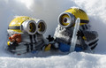
It is so cold outside.by clickodakComment by snaffles: Greetings from the Critique Club!
Hah, love the minions and their teeny little scarves and the snow atop their heads and goggles. Looks like the focus stacking experiment worked well!
The one thing you may want to do next time, in the outdoor studio especially, is remember that the light source (here, the sun) moves. Here it is up and behind the left minion and though it helps light the right minion's face (do they have faces?) the left one is in a relative amount of shadow. Just turning them around and shooting with the sun at your back may have helped, though you would then want to watch out for harsh shadows and too much glare. There are a few hot areas on the snow on the minions and the background snow; shooting at 1/400 or 1/500 should help.
hope this helps
Susan |
| Photographer found comment helpful. |
Home -
Challenges -
Community -
League -
Photos -
Cameras -
Lenses -
Learn -
Help -
Terms of Use -
Privacy -
Top ^
DPChallenge, and website content and design, Copyright © 2001-2026 Challenging Technologies, LLC.
All digital photo copyrights belong to the photographers and may not be used without permission.
Current Server Time: 07/22/2026 12:57:10 PM EDT.