| Image |
Comment |
| 09/21/2016 01:53:18 PM |
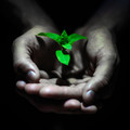
Natural Medicineby clickodakComment by sidpixel: Hello from the critique club
An appealing image that meets the challenge.
A great idea Marcel that generally works well but the skin tones let it down a little, they look unnatural and the plant is somewhat over-saturated too. True mono hands against the black background without the distracting greens and pinks together with a slightly more natural coloured plant and this excellent entry would have made the front page easily, like I say, its a great idea just a little lacking in execution. Thanks for another excellent entry Marcel, keep at it. |
 Photographer found comment helpful. Photographer found comment helpful. |
| 09/21/2016 10:35:44 AM |
|
| Photographer found comment helpful. |
| 09/15/2016 01:16:15 AM |
Natural Medicineby clickodakComment by Cyrilda: That looks like Basil. Did you know Basil made into a tea is good as a throat gargle, indigestion and and one of my favorite herbs. I really like this one.10 |
| Photographer found comment helpful. |
| 09/12/2016 05:03:01 AM |
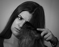
Untangling Hairby clickodakComment by sidpixel: Hello from the critique club
An interesting image that meets the challenge.
Your portrait certainly captures the frustration of combing through tangles in long hair. I like that you have made sure the eye is good and sharp, essential for any portrait and the way her eye is directed towards the problem hair. I think this is oe of those occasions where it would have been better in colour. The mono tones of the important focal point ie., her tangled hair are too similar to reveal it effectively. Alternatively a different pose where the comb and hair are more prominent would have proved effective too. Thanks for your entry Marcel. |
| Photographer found comment helpful. |
| 09/09/2016 06:19:43 AM |
Life is like a Camera...by clickodakComment by sidpixel: Hello from the critique club
An interesting image assumed to meet the challenge.
I say assumed because I am not familiar with the poem but thank you for your comments which are sentiments I'm sure we can all agree on. Whilst your image is not particularly original it is well executed, your DOF and focus is perfect and the mono presentation is pleasing. I really think it deserved a higher score and placing than you got but you can reflect on the way your photography has improved and how much better this image is than it would have been a year ago. Well done Marcel, keep at it. |
| Photographer found comment helpful. |
| 09/08/2016 11:50:08 PM |
|
| Photographer found comment helpful. |
| 09/08/2016 08:06:42 AM |
|
| Photographer found comment helpful. |
| 09/06/2016 11:45:42 PM |
|
| Photographer found comment helpful. |
| 09/05/2016 05:43:02 PM |
|
| Photographer found comment helpful. |
| 09/05/2016 11:51:29 AM |
|
| Photographer found comment helpful. |
Home -
Challenges -
Community -
League -
Photos -
Cameras -
Lenses -
Learn -
Help -
Terms of Use -
Privacy -
Top ^
DPChallenge, and website content and design, Copyright © 2001-2026 Challenging Technologies, LLC.
All digital photo copyrights belong to the photographers and may not be used without permission.
Current Server Time: 07/22/2026 10:19:27 PM EDT.