| Image |
Comment |
| 08/26/2014 09:25:57 PM |
|
 Photographer found comment helpful. Photographer found comment helpful. |
| 08/26/2014 08:09:36 PM |
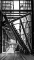
Modern designby clickodakComment by cowboy221977: Good day from the comment club.
Overall this is an OK shot. Not great but just OK. I think it would be much better if the sidewalk ramp was more centered in the shot. As far as the black and white aspect...... I like it. The colors and lighting I feel are spot on.
I hope this critique has helped you out. Keep it up.... Message edited by author 2014-08-26 20:17:56. |
| Photographer found comment helpful. |
| 08/26/2014 06:08:07 PM |
|
| Photographer found comment helpful. |
| 08/26/2014 08:19:05 AM |
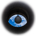
Colorful Festivalby clickodakComment by Mike: Critique Club Review:
Color Saturation and Hue: Colors are realistic
Brightness and contrast: image needs better lighting, lighting from below as well as on top may have been good option
Focus and depth of field: clean and sharp
its needs better lighting really make it pop but a great attempt otherwise. |
| Photographer found comment helpful. |
| 08/26/2014 08:16:09 AM |
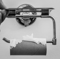
Coffee and Friendshipby clickodakComment by Mike: Critique Club Review:
Color Saturation and Hue: Colors are unrealistic and muddy
Brightness and contrast: image is a bit dark and uneven.
Focus and depth of field: you got some camera shake and at 1/15 shutter im not surprised.
nice concept that wasn't executed properly. you probably could have nailed a ribbon with this entry if it was sharp centered better during cropping and taken from a lower angle to accentuate the heart shape |
| Photographer found comment helpful. |
| 08/26/2014 08:05:38 AM |
Drinking and driving...can change your life foreverby clickodakComment by Mike: Critique Club Review:
Color Saturation and Hue: Colors look natural
Brightness and contrast: the image is very dark, maybe you monitor needs to be calibrated and it too bright, there are no black detail in the keys
Focus and depth of field: the image is clear and sharp
overall its a nice image and message, better lighting would have gone a long way here and maybe even a slightly lower perspective to see more reflection |
| Photographer found comment helpful. |
| 08/26/2014 07:50:11 AM |
|
| Photographer found comment helpful. |
| 08/25/2014 09:57:26 PM |
|
| Photographer found comment helpful. |
| 08/25/2014 09:16:33 PM |
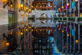
World Trade Centre Montrealby clickodakComment by Mike: critique club:
great image. vibrant colors, perfect reflection. the image seems a bit off center and i wonder if you put the horizon dead smack in the middle with a wide crop if it would be better. |
| Photographer found comment helpful. |
| 08/25/2014 04:57:17 PM |
|
| Photographer found comment helpful. |
Home -
Challenges -
Community -
League -
Photos -
Cameras -
Lenses -
Learn -
Help -
Terms of Use -
Privacy -
Top ^
DPChallenge, and website content and design, Copyright © 2001-2026 Challenging Technologies, LLC.
All digital photo copyrights belong to the photographers and may not be used without permission.
Current Server Time: 07/17/2026 12:54:23 AM EDT.