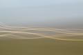
DPChallenge: A Digital Photography Contest You are not logged in. (log in or register
 
Browse Settings
Currently viewing:
Registered Userdivernick

Show comments:

Per page:

Order:

Comments:


Comments Received by divernick
Pages:   ... ...
Showing 371 - 380 of ~456
Image Comment
Fifteen Hundred
05/31/2004 12:42:07 AM
Fifteen Hundred
by divernick

Comment by wkoffel:
Surprised you didn't stop it dead on 3:00. Also, it seems like there's a lot of noise in the photo, on the metal of the watch, and the background. But it's a very attractive composition, and good sharpness.
Photographer found comment helpful.
At the Center
05/21/2004 04:12:24 PM
At the Center
by divernick

Comment by Spork99:
Nice idea, but the blue things are far more interesting to my eye than the aperture, 4
Photographer found comment helpful.
At the Center
05/20/2004 01:03:22 PM
At the Center
by divernick

Comment by wkoffel:
I'm very confused about the blue lights on the side. Interesting shot though. It either took very little work, or a *lot* or work, depending on exactly what this is. :)
Photographer found comment helpful.
Flow
05/19/2004 09:22:31 PM
Flow
by divernick

Comment by soup:
i look again, and am quite impressed that this is an unedited photo.
i gave it a 9 during the voting despite thinking it was generated....

well done.

Photographer found comment helpful.
Flow
05/14/2004 10:04:25 PM
Flow
by divernick

Comment by rananculus:
Greetings from the critique club!!!

This is a great photograph. Very strong composition, compelling visually, and certainly abstract. You provide a difficult subject to critique in depth, primarily because of the high quality of the shot. But here goes!! I'll rip you as I can.

The first question that I ask myself is when critiquing is, if this were mine, would I bother to print it and hang it on my wall. In this case the answer is definately yes.

The second question I ask, is if I were a photo editor, would I print it. And what would I ask the photographer to touch up. Keeping in mind that I would only want perfect photos appearing in my publication.

In the case of Flow...I would ask that you crop a little tighter. The light waves being higher to the left, are tugging my eye to the right. But be careful, the central ovals need to remain center. I might ask that you fade the green foreground on the left, just below where the lightwaves start, to match the foreground rather than the background.

I might ask that you do the same on the right, only the opposite, blend more skytones above the first light ray. All of this said to acheive more balance, and to keep my from veering right. Do those things, and I would print Flow.

I hope that you found this constructive. russ
Speed Jump
05/12/2004 02:04:05 AM
Speed Jump
by divernick

Comment by Lafaminit:
Excellent shot Nick!!!!
Flow
05/09/2004 11:55:08 PM
Flow
by divernick

Comment by dsidwell:
Outstanding composition. Gentle mood and lines. 10
Photographer found comment helpful.
Flow
05/07/2004 12:06:01 AM
Flow
by divernick

Comment by pmichaud:
I like the subtle colors and shapes. I will be interested to find out how you did this. Good work!! and Good Luck on the challenge!
Photographer found comment helpful.
Flow
05/06/2004 04:44:42 PM
Flow
by divernick

Comment by Mona:
Ver good and soft light.
Photographer found comment helpful.
Flow
05/05/2004 02:43:05 AM
Flow
by divernick

Comment by HRoxas:
nice and simple but i like it.
Photographer found comment helpful.
Pages:   ... ...
Showing 371 - 380 of ~456


Home - Challenges - Community - League - Photos - Cameras - Lenses - Learn - Help - Terms of Use - Privacy - Top ^
DPChallenge, and website content and design, Copyright © 2001-2025 Challenging Technologies, LLC.
All digital photo copyrights belong to the photographers and may not be used without permission.
Current Server Time: 08/02/2025 04:14:08 AM EDT.