| Image |
Comment |
| 02/20/2004 10:32:05 AM |
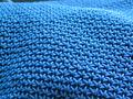
Purseby clarinet00Comment by e301: Good illumination of a texture here - though i do think you ought to have cropped entirely to the blue thing, rather than leaving that blank area at extreme top. Good light, good exposure, good colour, but lacking in a real subject for me: the patterning is simply not enough of itself. |
| 02/20/2004 02:30:28 AM |
Purseby clarinet00Comment by perempuan: Some bit on the top left corner a bit distracting, otherwise, interesting texture. |
| 02/19/2004 05:01:55 PM |
|
| 02/19/2004 01:34:10 PM |
|
| 02/19/2004 12:21:45 PM |
Purseby clarinet00Comment by jpochard: Nice color and texture. I would have cropped out the background in the upper left. |
| 02/19/2004 12:00:36 PM |
Purseby clarinet00Comment by jonpink: the close-ups are usualy dull as, but this is great thanks to a great blue and interesting weave! 9 |
| 02/18/2004 12:26:12 AM |
|
| 02/17/2004 07:47:19 AM |
|
| 02/17/2004 01:22:51 AM |
|
| 02/16/2004 06:48:35 PM |
Fire n' waterby clarinet00Comment by justine: Clever way to get two of the three. I do think you should be more aware of the background, lots of distraction back there. Also the shadow in front of the glass is attractive but it's cut off. |
Home -
Challenges -
Community -
League -
Photos -
Cameras -
Lenses -
Learn -
Help -
Terms of Use -
Privacy -
Top ^
DPChallenge, and website content and design, Copyright © 2001-2026 Challenging Technologies, LLC.
All digital photo copyrights belong to the photographers and may not be used without permission.
Current Server Time: 07/16/2026 04:32:35 PM EDT.