| Image |
Comment |
| 05/19/2004 07:52:27 AM |
|
 Photographer found comment helpful. Photographer found comment helpful. |
| 05/19/2004 02:42:45 AM |
|
| Photographer found comment helpful. |
| 05/19/2004 01:27:52 AM |
|
| Photographer found comment helpful. |
| 05/18/2004 04:48:48 PM |
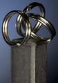
Opposites Attractby gajmajComment by 16point2mm: I enjoy the concept, and I think this shot makes a good statement. But at the same time, it lacks.... something. I really couldn't say what, but it just doesn't jump out at me. Maybe a different background color to offset the cold tone of the metal? Maybe a more simplistic metal (say, one ring instead of three?) to streamline the angles a bit more? I'm really not sure. |
| Photographer found comment helpful. |
| 05/18/2004 01:45:07 PM |
|
| 05/18/2004 05:50:46 AM |
Opposites Attractby gajmajComment by nicoledb: Lighting on this is very nice. Personally, I would have cropped more off the bottom, it seems a bit top-heavy now. |
| Photographer found comment helpful. |
| 05/16/2004 01:19:30 PM |
Opposites Attractby gajmajComment by hannafate: Um, I hate to be the one to break this to you, but steel is not the opposite of a magnet. It's an interesting composition, well exposed and focused, but without the challenge context, it seems nonsensical. |
| 05/14/2004 05:10:35 PM |
Opposites Attractby gajmajComment by peete: geart idea. maybe the lighting should have been worked on. the reflexions on the ring are a little too bright |
| Photographer found comment helpful. |
| 05/14/2004 04:46:09 PM |
|
| 05/14/2004 04:17:09 PM |
Opposites Attractby gajmajComment by sailracer_98: This is a good picture technically. I like the lighting and the DOF. I don't understand what is opposite about the elements in it, though. To me the picture needs something to add some life or soul to it. It feels very cold and clinical. Perhaps that was the intended effect. |
Home -
Challenges -
Community -
League -
Photos -
Cameras -
Lenses -
Learn -
Help -
Terms of Use -
Privacy -
Top ^
DPChallenge, and website content and design, Copyright © 2001-2026 Challenging Technologies, LLC.
All digital photo copyrights belong to the photographers and may not be used without permission.
Current Server Time: 07/17/2026 10:16:09 AM EDT.