| Image |
Comment |
| 06/12/2003 11:39:26 PM |
|
 Photographer found comment helpful. Photographer found comment helpful. |
| 06/12/2003 04:29:39 PM |
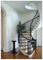
Home and Design by sherComment by jillz: Very good shot. This is what I was hoping for from this challenge. I like how the staircase leads your eye up into th ceiling. |
| Photographer found comment helpful. |
| 06/12/2003 09:14:02 AM |
Home and Designby sherComment by sagestudio: I want this in my house. This is a nice clean shot there fits the challenge very well. I can totally see this on the cover of "Home and Design". |
| Photographer found comment helpful. |
| 06/12/2003 09:06:47 AM |
|
| Photographer found comment helpful. |
| 06/12/2003 06:03:48 AM |
|
| Photographer found comment helpful. |
| 06/11/2003 09:46:01 PM |
|
| Photographer found comment helpful. |
| 06/11/2003 08:34:23 PM |
Home and Designby sherComment by qachyk: This is an amazing-looking home, if it's yours I'm very jealous.
Also, I can EASILY see this gracing a home design magazine. Even though there's very little in the way of decor it's the sort of clean, simple lines such publications seem to favor for shots like this. It's very crisp and clear, well-lit and cheerful. There's room for copy and logo. |
| Photographer found comment helpful. |
| 06/11/2003 05:03:42 PM |
Home and Designby sherComment by RiderGal: Wow very pretty, if this is your house, this is really cool, congrats! I think this would do nicely as a cover of a magazine... I'm not sure about the border, I'm not big on borders, and I don't think most magazine covers have borders, but it's not too big of a deal. This is a plain simple nice looking photo that fits the challenge. Good job. |
| Photographer found comment helpful. |
| 06/11/2003 01:29:07 PM |
Home and Designby sherComment by wewillexplore: Nice shot! Could have used a plethora of titles for this one. Good natural lighting, awesome composition. I would have put a bit more or a bit less of that archway on the left. 9 |
| Photographer found comment helpful. |
| 06/11/2003 01:00:36 PM |
Home and Designby sherComment by moodville: Oh how I wish my house looked like this! First impressions are that it's a clean image (and clean staircase), and very classy-looking. The curve of the staircase is appealing to the eye and something that isnt common and so it gives a sense of interest. It would certainly be a cover I'd expect to see on Home and Design and it would encourage me to read the accompanying article. The only negative is something petty, but I find the whiteness of the border makes the white in the photograph to appear somewhat duller, which is a shame because otherwise the feel is a bright, airy room. |
| Photographer found comment helpful. |
Home -
Challenges -
Community -
League -
Photos -
Cameras -
Lenses -
Learn -
Help -
Terms of Use -
Privacy -
Top ^
DPChallenge, and website content and design, Copyright © 2001-2026 Challenging Technologies, LLC.
All digital photo copyrights belong to the photographers and may not be used without permission.
Current Server Time: 07/18/2026 06:20:40 AM EDT.