| Image |
Comment |
| 10/07/2005 07:06:01 PM |
|
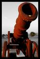
| 10/06/2005 01:26:05 AM |
The Old Southby DefyTimeComment by ladyhawk22: Nice pic with good perspective and intriguing lighting. I like the desat except for the fact that the tree in the background is not desaturated. Really good angle on the shot. |
| 10/04/2005 09:11:13 AM |
|
| 10/04/2005 01:29:13 AM |
|
| 09/24/2005 03:20:25 AM |
|
| 09/23/2005 03:42:30 PM |
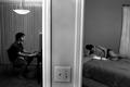
Doors to Eruditionby DefyTimeComment by mycelium: division of the frame is very cool. did you do some burning on the light switch? the one on the right looks like it's in an unnaturally dark patch. |
| 09/22/2005 09:30:56 PM |
|
| 09/21/2005 08:22:34 AM |
|
| 09/20/2005 09:56:31 PM |
Doors to Eruditionby DefyTimeComment by kirbic: I like the basic idea... the distortion and tilt of the door frame detracts for me. The light switch doesn't seem to be adding anything, I wonder if hooting from bit higher could have eliminated it? |
| 09/20/2005 02:50:53 PM |
Doors to Eruditionby DefyTimeComment by LeeD: I understand what you're going for here, but the image alone shows a disturbing separation to me. The fact that you used a male and a female of approximately the same age could indicate a couple. The separation of the wall brings a general coldness to the image IMHO and taken without the title shows a "destination" quite different from what your intent was. The cropping also seems a little awkward and my focus keeps shifting to the light switch. I think the choice of black and white is a good one, but it further adds to the "cold" feeling I get from the image. I think that with a different title, the statement made by this image could have much more impact. |
Home -
Challenges -
Community -
League -
Photos -
Cameras -
Lenses -
Learn -
Help -
Terms of Use -
Privacy -
Top ^
DPChallenge, and website content and design, Copyright © 2001-2026 Challenging Technologies, LLC.
All digital photo copyrights belong to the photographers and may not be used without permission.
Current Server Time: 07/24/2026 10:21:36 AM EDT.