| Image |
Comment |
| 02/28/2006 06:33:41 PM |
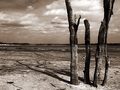
...Parched...by DefyTimeComment by JunieMoon: Very moody pic. I love the starkness of the tree group in the foreground. Your choice of tone doesn't necessarily depict being parched, but the trees definitely do. I also like the way that you show the shadow, which completes the upper part of the tree which we don't see. Nice job. |
| 02/28/2006 11:46:30 AM |
|
| 02/27/2006 04:12:58 PM |
|
| 02/27/2006 06:18:51 AM |
Phone Homeby DefyTimeComment by Chinabun: kinda confused on how this placed so low. i gave it a 9. actually, i thought alot of the entries in the top 20 didnt deserve to be there, but what do i know. |
| 02/27/2006 01:01:36 AM |
|
| 02/26/2006 10:05:44 PM |
|
 Photographer found comment helpful. Photographer found comment helpful. |
| 02/26/2006 08:13:09 PM |
|
| 02/26/2006 02:15:22 PM |
|
| 02/25/2006 12:10:09 PM |
|
| 02/25/2006 11:39:11 AM |
Phone Homeby DefyTimeComment by LucidLotus: Aww. I love that movie. I can't remember if his chest glows inside on this doll (that's what it looks like) which if so that can be tough to not get some blown out looking stuff, it also ends up making it look like his chest is gilded a bit which is a tad distracting. Not sure how that could be adjusted though. I do like the tact you took for the simple presentation and how his finger and eyes really glow out of the blackness. I wish there was a skosh more negative space on the right and left though. When I look at it *I* feel a bit cramped. The use of light looks good but the focus seems a smidge soft. I think this would have benefitted from a border too. I gave a 4. |
Home -
Challenges -
Community -
League -
Photos -
Cameras -
Lenses -
Learn -
Help -
Terms of Use -
Privacy -
Top ^
DPChallenge, and website content and design, Copyright © 2001-2026 Challenging Technologies, LLC.
All digital photo copyrights belong to the photographers and may not be used without permission.
Current Server Time: 07/25/2026 11:19:52 PM EDT.