Newhall Parkby
cvhs99Comment by Manic: Critique Club comment :o)
Composition:
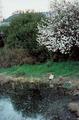
The first thing that strikes me about this photo is that it feels slightly lopsided - the lines of the roof and the base of the hedgerow both slant down to the left, so perhaps a rotation of this shot would have helped.
The focal point of the shot seems to be cat and the treestump (which I first thought was another cat) by the water's edge. However, they're too small to make out any detail, so there's nothing really to look at, so maybe a closer crop/zoom or a different angle would have helped.
From what I can tell, the bank comes down the righthand edge of the frame (and just out of it) towards the bottom of the shot - if you'd taken this shot a few feet to the right and got this in frame, the curved line of the bank would probably lead the eye more smoothly through the image. Alternatively, shooting from a different angle a good few feet away could give some depth and lines to the hedge, which would be useful in leading into the focal point.
Background:
My personal opinion about landscapes is that buildings should either be out of shot, or be an integral part of the image - the roof in shot here is quite distracting, so perhaps a lower shooting angle could have hidden it behind the hedge.
Camera Work:
The focus and DoF on this shot is good. However, since you've not included your Aperture / ISO / Shutter settings, I can't say much more on this.
Post Processing:
Since you've not provided any details, I can only guess as to the post processing you've done, if any. One important thing to mention is that this shot is only 68Kb, out of a maximum 150Kb, therefore you may have lost quite a bit of detail by compressing the image down to that size - I always recommend that you try to get as close to the 150Kb line as possible, so that as little detail as possible is lost.
This shot feels in many ways like some of the ones I've taken on gloomy days round where I live - unless you're trying to emphasise that gloominess, I'd advise that you increase the saturation and play about with the levels to get more contrast into the shot, and make it feel a bit warmer. Its also worth converting shots to b&w, to see if they work better that way - I suspect that this shot could be one that does.
My Opinion:
I think that this is a potentially reasonable photo, but its let down by the composition and muted colours. There also feels like a lack of depth to the shot, since that hedge is flattening the background. As for the "Landscape" challenge, this photo meets it, but doesn't do anything more than that.
If you have any questions about this critique, please feel free to contact me via the PM system.