| Image |
Comment |
| 03/15/2004 06:46:51 AM |
Untitledby andywightmanComment by Mousie: cute, but there's not much contrast between her and the background... similar palette and tones don't make her pop out of the frame. |
 Photographer found comment helpful. Photographer found comment helpful. |
| 03/15/2004 02:13:03 AM |
|
| Photographer found comment helpful. |
| 03/15/2004 12:27:39 AM |
Untitledby andywightmanComment by rickhd13: the coloring is nice and focus is right on...i maybe would have cropped a little tighter in on the right side and lost some of that dead space |
| Photographer found comment helpful. |
| 03/14/2004 09:59:43 PM |
|
| Photographer found comment helpful. |
| 03/14/2004 05:44:57 PM |
|
| Photographer found comment helpful. |
| 03/14/2004 05:01:48 PM |
Untitledby andywightmanComment by rickhd13: very nice shot...composition is great...colors are nice...and the look on her face sells it for me...good luck |
| Photographer found comment helpful. |
| 03/14/2004 12:46:30 PM |
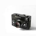
A Design Classicby andywightmanComment by DJLuba: I can see some odd marks around the camera. Are thos eraser marks?
Where it goes from hard white, to a lighter dirtier white. |
| Photographer found comment helpful. |
| 03/14/2004 10:29:12 AM |
|
| Photographer found comment helpful. |
| 03/14/2004 06:31:56 AM |
|
| Photographer found comment helpful. |
| 03/13/2004 07:47:34 PM |
|
| Photographer found comment helpful. |
Home -
Challenges -
Community -
League -
Photos -
Cameras -
Lenses -
Learn -
Help -
Terms of Use -
Privacy -
Top ^
DPChallenge, and website content and design, Copyright © 2001-2026 Challenging Technologies, LLC.
All digital photo copyrights belong to the photographers and may not be used without permission.
Current Server Time: 07/17/2026 12:54:51 AM EDT.