| Image |
Comment |
| 02/15/2005 03:16:22 AM |
Thinking (naturally)by Ecce_SignumComment by Imagineer: Well - may I suggest you try thinking with your clothes on? It's a bit warmer.
Nice tones. Composition bothers me a bit with too much dead space top right. Your back is cropped too tight. I'd have burned back the glare from your front arm. |
 Photographer found comment helpful. Photographer found comment helpful. |
| 02/15/2005 01:30:26 AM |
|
| Photographer found comment helpful. |
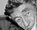
| 02/14/2005 11:25:38 PM |
Dadby Ecce_SignumComment by srbrubaker: I like this photo much; it captures the spirit of a man with a distinctive face (didn't I see this man carrying a box in the 'pain' challenge?)
I know that I am on the lunatic fringe, but I like the contrast of the original - or at least I'd end up with it closer to the original version than to Mike Owen's. Mike Owen's cropping job seems to improve the photo considerably. It solves a number of problems and puts the emphasis right where it belongs. |
| Photographer found comment helpful. |
| 02/14/2005 02:57:39 PM |
|
| Photographer found comment helpful. |
| 02/14/2005 10:43:52 AM |
Thinking (naturally)by Ecce_SignumComment by terje: great concept, however I find it a little too harsh on the lightning, also a little under exposed for my taste. but it's 100% honest and that counts a lot. well done 8 |
| Photographer found comment helpful. |
| 02/14/2005 09:14:43 AM |
|
| Photographer found comment helpful. |
| 02/12/2005 07:44:17 PM |
|
| Photographer found comment helpful. |
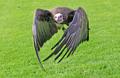
| 02/07/2005 07:22:40 PM |
closing in...by Ecce_SignumComment by thatcloudthere: Um...I'm not sure if you know this, but this has to be one the best bird photos in existence!
It is absolutely perfect as far as the exposure and moment goes! I love it! Message edited by author 2005-02-07 19:22:55. |
| Photographer found comment helpful. |
| 02/06/2005 04:12:52 PM |
Dadby Ecce_SignumComment by Ecce_Signum: Thanks for your help Mike :) looks grea, and as for the USM, the eyebrows are really that wirey! Message edited by author 2005-02-06 16:51:50. |
| 02/03/2005 01:44:27 PM |
Dadby Ecce_SignumComment by MikeO: Hi Andy - Like the photo, he looks quite a character! Anyway did not do much but thought it had maybe a bit too much contrast so I cropped it and dropped the contrast and brightness down a fair bit and here is the result. Maybe I have overdone the usm a bit??
 Message edited by author 2005-02-03 17:33:04. Message edited by author 2005-02-03 17:33:04. |
| Photographer found comment helpful. |
Home -
Challenges -
Community -
League -
Photos -
Cameras -
Lenses -
Learn -
Help -
Terms of Use -
Privacy -
Top ^
DPChallenge, and website content and design, Copyright © 2001-2026 Challenging Technologies, LLC.
All digital photo copyrights belong to the photographers and may not be used without permission.
Current Server Time: 06/11/2026 02:06:49 PM EDT.