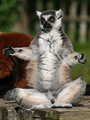
DPChallenge: A Digital Photography Contest You are not logged in. (log in or register
 
Browse Settings
Currently viewing:
Registered Userizadoodle

Show comments:

Per page:

Order:

Comments:


Comments Received by izadoodle
Pages:   ... [119] [120] [121] [122] [123] [124] [125] ... [135]
Showing 1211 - 1220 of ~1350
Image Comment
lemurboy
05/23/2007 10:53:00 AM
lemurboy
by izadoodle

Comment by snaffles:
hmmph - look like Yoda, this one does! 8
Photographer found comment helpful.
lemurboy
05/23/2007 09:31:08 AM
lemurboy
by izadoodle

Comment by magenmarie:
HAHA! That pose is too funny!
Photographer found comment helpful.
lemurboy
05/23/2007 05:56:59 AM
lemurboy
by izadoodle

Comment by Pedxer:
Hahah look at its expression!
Photographer found comment helpful.
lemurboy
05/23/2007 01:01:32 AM
lemurboy
by izadoodle

Comment by Alley Cat:
haha cute
Photographer found comment helpful.
Yellow Cactus
05/22/2007 01:47:19 PM
Yellow Cactus
by izadoodle

Comment by LeeD:
Nice, the subtle yellows work well for this image.
A B C
05/14/2007 08:42:12 AM
A B C
by izadoodle

Comment by KaDi:
Greetings from the Critique Club!

I like wood blocks and the way they can help me recall the other things of childhood. This image, however, does seem like a "product shot"...which is fine except in the context of the challenge. Yes, Dr. Seuss published an A, B, C's book...but so have many other children's authors... What makes this particulary Seuss-like?

The lighting renders the texture of the face of the blocks. The background neither adds nor detracts from their representation. The blocks are carefully arranged, neatly stacked...but not very reminiscent of the energy or mischeviousness of Seuss.

Overall, the shot is technically competent and offers a record of wood blocks.

Keep shooting and play whenever you can.
Orissa
05/12/2007 06:39:45 PM
Orissa
by izadoodle

Comment by dr rick:
Greetings from the Critique Club

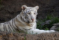
A beautiful animal in a rather typical pose. Focus and exposure are great, and the photo nicely captures the unique markings and the texture of its fur. But nothing to really give the photo impact.

The main problem, as Ben pointed out, is that the photo is rather flat; the three dimensional form of the tiger isn't apparent here. Form is defined in photographs by shadow, and the light in the shade here is very diffuse; it doesn't cast shadows. Thus the flat appearance. Not a lot can be done about that, but perhaps at a different time of day the light would reflect into the exhibit more strongly from one direction than another and cast some shadows.

Another problem, also pointed out by Ben as well as others, is the centered composition, which is rarely interesting. But if you crop off the left side to eliminate the stick in the background, and also a bit of the top and bottom, you get a lot more interesting photo.

Finally, there is a slight blue color cast here. Objects in shade are lit by indirect light from the blue sky, so appear bluish. Compensating for it will make the overall colors warmer and add some life to the photo.
A B C
05/12/2007 05:48:12 PM
A B C
by izadoodle

Comment by mpeters:
Fairly static arrangement but your colors look good.
A B C
05/11/2007 06:40:21 PM
A B C
by izadoodle

Comment by roxy2345:
to the point!!
A B C
05/11/2007 04:27:42 PM
A B C
by izadoodle

Comment by Tygerr:
On it's way to a microstock site. Need to keep that white background a bit whiter though.
Pages:   ... [119] [120] [121] [122] [123] [124] [125] ... [135]
Showing 1211 - 1220 of ~1350


Home - Challenges - Community - League - Photos - Cameras - Lenses - Learn - Help - Terms of Use - Privacy - Top ^
DPChallenge, and website content and design, Copyright © 2001-2025 Challenging Technologies, LLC.
All digital photo copyrights belong to the photographers and may not be used without permission.
Current Server Time: 08/22/2025 03:37:27 PM EDT.