| Image |
Comment |
| 03/24/2004 06:11:04 PM |
|
 Photographer found comment helpful. Photographer found comment helpful. |
| 03/24/2004 05:39:04 PM |
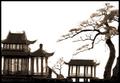
Arts of Asiaby torrenzanoComment by brett2004: I have a little scene just like this enclosed in glass. I kind of think if the subject was completely black it would almost look like an ink drawing - or color paints. I feel you should have burned the glare on the top left of the large building though. good composition. |
| Photographer found comment helpful. |
| 03/23/2004 10:46:50 PM |
Arts of Asiaby torrenzanoComment by MWitt: The backlighting is a little too harsh for me. I wonder if you were going for a silhouette. This would have made a great silhouette with all the fine detail in the buildings and tree. Composition works for me. 7 |
| Photographer found comment helpful. |
| 03/23/2004 05:10:01 AM |
Arts of Asiaby torrenzanoComment by cbonsall: (I'm writing this to everyone who submitted a landscape shot) The challenge was to produce a shot worthy of a magazine cover but to me a shot like this is not suitable to be put on a "portrait" format magazine.
Is thi sa model? Nice pic though
---ADDITIONAL---
Due to forum discussions and accusations that marking landscapes down is nitpicking, I'm going through them and remarking. I still think some of the landscapes would not make good covers because of their orientation but I am no longer marking down because of that.
I still think landscape is inapropriate for the majority of magazines but I'll give the benefit of the doubt to the photographers. |
| Photographer found comment helpful. |
| 03/22/2004 07:25:39 PM |
|
| Photographer found comment helpful. |
| 03/22/2004 03:12:24 PM |
Arts of Asiaby torrenzanoComment by Tallbloke: Beautiful shot, I really like this but I'm marking all "landscape" shots a point lower as I don't believe they fit the challenge parameters. |
| Photographer found comment helpful. |
| 03/22/2004 08:59:39 AM |
|
| Photographer found comment helpful. |
| 03/22/2004 07:44:37 AM |
|
| Photographer found comment helpful. |
| 03/08/2004 12:47:13 PM |
|
| 03/07/2004 02:29:07 AM |
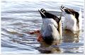
Join Us?by torrenzanoComment by rixport: nice shot and nice interpretation of the challenge.. at first i thought the picture could have been better balanced with the ducks more in the middle, but the inclusion fo the water motiion is nice.. nice detail.. |
Home -
Challenges -
Community -
League -
Photos -
Cameras -
Lenses -
Learn -
Help -
Terms of Use -
Privacy -
Top ^
DPChallenge, and website content and design, Copyright © 2001-2026 Challenging Technologies, LLC.
All digital photo copyrights belong to the photographers and may not be used without permission.
Current Server Time: 07/16/2026 11:46:10 PM EDT.