| Image |
Comment |
| 02/18/2004 11:42:44 AM |
|
 Photographer found comment helpful. Photographer found comment helpful. |
| 02/18/2004 08:22:36 AM |
RIDGESby TLL061Comment by Melina: not a very contrasty tonal range on the bark. could benefit from stronger lighting. |
| Photographer found comment helpful. |
| 02/18/2004 01:13:36 AM |
RIDGESby TLL061Comment by Prof_Fate: way too dark - see //www.luminous-landscape.com/tutorials/expose-right.shtml |
| Photographer found comment helpful. |
| 02/17/2004 06:54:40 PM |
Blown Awayby TLL061Comment by ramevi: Mmm, maybe an outdoor shot would make this much more interesting, but that´s just me... |
| Photographer found comment helpful. |
| 02/17/2004 05:21:58 PM |
Blown Awayby TLL061Comment by drgsoell: I like the windy day effect shown by the statuette, but the background (wrinkles, not folds) detracts from the picture. |
| Photographer found comment helpful. |
| 02/17/2004 02:08:46 AM |
Blown Awayby TLL061Comment by nborton: there are a number of things that could be done to improve your picture.
lighting - the lighting is not very interesting and is casting in the same direction of the shot, which creates a flat looking image. i would try and experiment with different lighting directions.
background - the background could be improved by moving the figure further away from the cloth drop. there is nothing really wrong with the cloth, but if the figure was further from it there wouldn't be harsh black shadows casting on the cloth.
crop and perspective - i would suggest getting closer to your subject and trying to pick out what it is that interests you. once you find what it is, you can get closer on it and leave out all the other parts. also along with getting closer you could try different angles to shoot from that would create unusual views, which would in turn interest the viewer.
working on these things would improve any picture from looking like you are trying to sell something, to something more artistic. |
| Photographer found comment helpful. |
| 02/10/2004 03:07:53 PM |
METRICby TLL061Comment by andywightman: mm - getting to see too many spanners ijn this challenge but....vote on all equally. Like the choice of colours here. Might be improved with slightly better focus? Fine shot though. |
| Photographer found comment helpful. |
| 02/08/2004 10:54:13 PM |
|
| Photographer found comment helpful. |
| 02/07/2004 09:52:18 PM |
METRICby TLL061Comment by LoudDog: Too small and grainy. More subject and less background would also be better. |
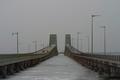
| 02/07/2004 01:30:31 PM |
DUAL BRIDGESby TLL061Comment by inspzil: This would be a much better picture on a different day. Lets just pick a day like June 30th. Sky is utterly depressing as I live in Michigan and I know all about this crappy sky business. Looks like it could be an interesting picture, just not when you took it. |
| Photographer found comment helpful. |
Home -
Challenges -
Community -
League -
Photos -
Cameras -
Lenses -
Learn -
Help -
Terms of Use -
Privacy -
Top ^
DPChallenge, and website content and design, Copyright © 2001-2026 Challenging Technologies, LLC.
All digital photo copyrights belong to the photographers and may not be used without permission.
Current Server Time: 06/10/2026 02:58:51 PM EDT.