| Image |
Comment |
| 07/28/2004 12:47:03 PM |
|
| 07/27/2004 05:09:39 PM |
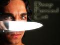
deep pierced cutby theodor38Comment by bongo: Love the catchlight in the eyes.
Focus is pin sharp.
Love the font on your text. Very well done. Excellent job!!!
Side note: I mentioned this in a thread earlier this week, I can see your photo skills improving at a phenomenal pace lately. You are obviously experiencing a growth/learning spike right now. Ride it out! (MHO) |
| 07/27/2004 03:31:17 PM |
|
| 07/27/2004 03:58:38 AM |
deep pierced cutby theodor38Comment by Jesuispeure: I like the emotion a lot, but the knife covering the nose strikes me funny somehow. Maybe if you had put it under one eye instead? |
| 07/27/2004 12:21:28 AM |
deep pierced cutby theodor38Comment by Neuferland: Hello theo. Nice shot, interesting take on the challenge with the name. But you can't hide behind the knife, you have very distinct eyes.
The light on the knife is a bit blown out and I'm not really sure I like the halo created by the light around the edges of the knife, it really doesn't add to the shot for me. I'm a basically peaceful person so this particular album cover wouldn't appeal to me on an overal sense. A 7 |
| 07/26/2004 01:18:52 PM |
deep pierced cutby theodor38Comment by melismatica: I really don't like the band name. It sounds very awkward. Maybe Deeply Pierced Cut would have worked a little better? The text looks over Photoshopped to be authentic. The photo works well, although the glowing edge of the blade against the skin looks strange. |
| 07/26/2004 12:34:10 PM |
|
| 07/26/2004 06:41:16 AM |
|
| 07/26/2004 12:41:04 AM |
|
| 07/25/2004 09:01:55 PM |
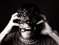
freedom of expression!by theodor38Comment by melismatica: Greetings from the Critique Club
This is a very good self-portrait. It's striking but has a light-hearted feel. I'm not sure if that was the effect you intended but that's how I see it. It could be because I've grown familiar with your self-portraits which generally seem to be done with a certain amount of humor.
The greys have a pleasing, warm tone. I particularly like the warmth and detail of the skin texture that you managed to capture on the left arm. I'd like to see a bit more detail in the left arm. Perhaps a bit more detail to the darks at the top of the frame so that the hair isn't totally absorbed into the black background. I think perhaps a little bit more light on the left side; not so much as to lose the mood--just enough to bring out a bit more of the eye. Looking at it in PS, it is not quite as dark, so it might just be the differences in monitors. What I see on DPC is a startling highlight in the eye but much of the rest of the detail is lost in darkness.
Really, this is a pretty great photo. The things I've mentioned are just nitpicks after carefully perusing the photo for an in-depth critique. I'm not really sure how much I'm supposed to discuss how well the photo met the challenge. When I saw this during the voting, I felt it met the challenge in a creative way but was perhaps a bit challenging for the average voter. I don't think that has much bearing on the quality of the photo, which is quite good.
Thanks for sharing it.
Melissa |
Home -
Challenges -
Community -
League -
Photos -
Cameras -
Lenses -
Learn -
Help -
Terms of Use -
Privacy -
Top ^
DPChallenge, and website content and design, Copyright © 2001-2026 Challenging Technologies, LLC.
All digital photo copyrights belong to the photographers and may not be used without permission.
Current Server Time: 07/16/2026 05:53:05 PM EDT.