| Image |
Comment |
| 07/14/2006 01:04:45 PM |
|
| 07/13/2006 08:30:22 AM |
|
| 07/12/2006 01:47:35 PM |
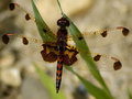
Lifeline or Eyesore?by captbenderComment by Lena: Great picture - love the colours. I think you should have been a fraction further to the right though when taking the shot, e.g. the vertical bar just above the cross doesn't quite point to the centre of the cross. In an image that relies heavily on the perspective, it would have been more striking if it was spot on (I have exactly the same problem with my entry by the way!!) |
| 07/09/2006 08:23:56 PM |
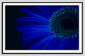
The Bluesby captbenderComment by digitalknight: very subtle and nice lighting - maybe just a touch brighter would suit me better, but who am I? Just a hack with a vote :-) 7 |
| 07/08/2006 06:47:53 AM |
|
| 07/06/2006 11:49:58 PM |
The Bluesby captbenderComment by Geee: I like the rich colour and interesting composition but my eyes are asking for more sharpness. |
| 07/05/2006 11:34:49 PM |
|
| 07/05/2006 10:22:11 PM |
The Bluesby captbenderComment by Melethia: OK, how did you match the page color within the frame? Like the framing effect. Flower doesn't suck either. |
| 07/05/2006 06:02:58 PM |
The Bluesby captbenderComment by electina: I don't really like the color here. The composition is nice, but the color doesn't move me. Sorry. |
| 07/05/2006 04:14:39 PM |
|
Home -
Challenges -
Community -
League -
Photos -
Cameras -
Lenses -
Learn -
Help -
Terms of Use -
Privacy -
Top ^
DPChallenge, and website content and design, Copyright © 2001-2026 Challenging Technologies, LLC.
All digital photo copyrights belong to the photographers and may not be used without permission.
Current Server Time: 07/16/2026 11:42:42 AM EDT.