| Image |
Comment |
| 08/19/2005 08:48:10 AM |
|
| 08/19/2005 03:29:22 AM |
|
| 08/17/2005 03:20:24 PM |
|
| 08/17/2005 02:25:26 PM |
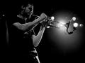
Airby Rusch24Comment by BobsterLobster: I like the backlighting, and the silhouette of the end of the trumpet. I wish it was much sharper though. |
| 08/17/2005 02:10:17 PM |
|
| 08/17/2005 11:23:00 AM |
Airby Rusch24Comment by DrAchoo: Great pic. I'll forgive the graininess because I'm sure it was dark when you shot it. The light as highlight is nearly perfectly placed (sometimes better lucky than good). I like the focus point being the mike, although some others might want it on his face. I give it a 10. |
| 08/17/2005 05:26:47 AM |
|
| 07/26/2005 07:54:35 AM |
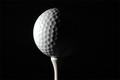
Golf Ballby Rusch24Comment by leahtaas: good b/w tones... good texture except for the washed-out part of the ball. nice concept which can be a good advertising photo. |
| 07/25/2005 12:03:15 PM |
|
| 07/23/2005 07:33:48 PM |
Golf Ballby Rusch24Comment by Dr.Confuser: Beautifull;y done. Very minimalist. Very austere. And very effective at using light and shadow to convey texture. |
Home -
Challenges -
Community -
League -
Photos -
Cameras -
Lenses -
Learn -
Help -
Terms of Use -
Privacy -
Top ^
DPChallenge, and website content and design, Copyright © 2001-2026 Challenging Technologies, LLC.
All digital photo copyrights belong to the photographers and may not be used without permission.
Current Server Time: 07/16/2026 11:59:58 AM EDT.