| Image |
Comment |
| 02/05/2004 07:40:42 AM |
|
 Photographer found comment helpful. Photographer found comment helpful. |
| 02/04/2004 01:52:23 PM |
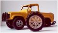
broken carby HeidieComment by snowflake: I love yellows in pictures. Nice capture of that. The wheel seems off placement somehow. Maybe placing it in a different place would have helped? Good job. |
| Photographer found comment helpful. |
| 02/04/2004 10:55:02 AM |
broken carby HeidieComment by aKiwi: Looses credability as the wheels don't match. Lighting is good though. |
| Photographer found comment helpful. |
| 02/04/2004 08:13:44 AM |
|
| Photographer found comment helpful. |
| 02/04/2004 01:46:26 AM |
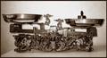
libraby HeidieComment by Heidie: Thanks for all the comments, I agree with the lightings comments, it is harsh. I wasn't very satisfied myself but wanted to submit my first pic altough I didn't have much time to make something :-) |
| 02/03/2004 11:06:30 PM |
libraby HeidieComment by AFViper: The subject is interesting, but I think you could have tried a more interesting perspective to improve the photo, its just too ordinary right now. The lighting is a little harsh especially in the background which is blown out in the center. The two edges on the left, and the wall are a little distracting. |
| Photographer found comment helpful. |
| 01/31/2004 12:29:32 PM |
libraby HeidieComment by Jaguar: Great scales, stronger rating if you macro on the scales to capture ornate emblems and character. Don't take shot of the whole thing since we would know by your macro enough that it is a scale. |
| Photographer found comment helpful. |
| 01/31/2004 01:09:22 AM |
libraby HeidieComment by train: Nice one! although the lighting seems a bit harsh at the top
Good idea |
| Photographer found comment helpful. |
| 01/30/2004 05:58:22 PM |
libraby HeidieComment by melking: Well done, fits the Challenge great! I am a Libra...those scales are very nice looking are they old...? the only thing I would have changed would be the edge of the Table is a bit out of place. But that is just me....I give you a 10 |
| Photographer found comment helpful. |
| 01/30/2004 03:54:24 PM |
libraby HeidieComment by Kavey: Nice set of scales and I think the choice of black and white with toning brings out the detail. Lighting is somewhat uneven, perhaps softening it by putting a sheet or tissue infront of the light source might help. I'd also consider using a large sheet of card, curved to provide both surface and backdrop, to remove lines and remove background detail more effectively. |
| Photographer found comment helpful. |
Home -
Challenges -
Community -
League -
Photos -
Cameras -
Lenses -
Learn -
Help -
Terms of Use -
Privacy -
Top ^
DPChallenge, and website content and design, Copyright © 2001-2026 Challenging Technologies, LLC.
All digital photo copyrights belong to the photographers and may not be used without permission.
Current Server Time: 07/20/2026 06:42:27 AM EDT.