| Image |
Comment |
| 04/19/2004 01:54:54 AM |
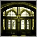
Untitledby leafComment by photom: The reflections are marvelous, but the challenge of Silhouettes is very weak.
|
 Photographer found comment helpful. Photographer found comment helpful. |
| 04/19/2004 01:31:46 AM |
Denied Entry by leafComment by JPR: Great work leaf. I am a fan of your body of work as a whole. You are a fine addition to this community. Adding this to my favorites. |
| Photographer found comment helpful. |
| 04/18/2004 10:16:13 PM |
Denied Entryby leafComment by tyt2000: Really great composition, off-centering the person. I like the idea, I think its very original. B&W would have looked better than the yellow tone. The white line in the border is too thick though. Its still a nice photo.
Good luck... |
| Photographer found comment helpful. |
| 04/18/2004 06:24:58 PM |
|
| Photographer found comment helpful. |
| 04/18/2004 11:18:18 AM |
|
| Photographer found comment helpful. |
| 04/18/2004 05:23:20 AM |
|
| Photographer found comment helpful. |
| 04/18/2004 12:17:04 AM |
|
| Photographer found comment helpful. |
| 04/17/2004 04:45:05 PM |
Denied Entryby leafComment by obstetrify: This looks a bit forbidding. Just the right amount of light. To me it seems to lean slightly to the right, but it might just be the perspective. |
| Photographer found comment helpful. |
| 04/16/2004 06:37:14 PM |
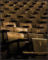
Strength in Numbersby leafComment by admart01: I like what you've done here - sepia excellent choice; emotionally the title fits and the image fits the title thereby connecting the image to the theme (without the title I don't think it works) Nicely done - one of my favorite for the challenge |
| Photographer found comment helpful. |
| 04/16/2004 05:30:22 PM |
Strength in Numbersby leafComment by redmoon: this is a fantastic shot. the sepia tone works wonderfully well, as does the angle of the shot (i love that you got the number one chair right there in the foreground) and the whole style of the thing is very appealing. the way it's all lit - splendid! the title is a bit of a tired cliche, but you've used it well, with great panache and class. 10. |
| Photographer found comment helpful. |
Home -
Challenges -
Community -
League -
Photos -
Cameras -
Lenses -
Learn -
Help -
Terms of Use -
Privacy -
Top ^
DPChallenge, and website content and design, Copyright © 2001-2026 Challenging Technologies, LLC.
All digital photo copyrights belong to the photographers and may not be used without permission.
Current Server Time: 07/17/2026 02:43:48 PM EDT.