| Image |
Comment |
| 04/28/2005 09:15:07 PM |
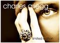
CGby whiteroomComment by fplouffe: Likes the muddy color. Good composition. Eye's color seems to match ring's color, well done. Highlight tooblown out on the hand however. |
 Photographer found comment helpful. Photographer found comment helpful. |
| 04/28/2005 06:48:10 PM |
CGby whiteroomComment by Montereykiddo: Love it! This could be in a magazine for sure. Even though its overexposed (i know this is on purpose) and it looks very processed I've seen plenty of ads like this and it has an appel to it. Nice work! 10 |
| Photographer found comment helpful. |
| 04/28/2005 04:27:02 PM |
CGby whiteroomComment by buzzmom: great job i feel like i opened up the new york times magazine section when i saw this.....well done from the representation of the product to the use of the model almost daring you to take whats hers....best of luck |
| Photographer found comment helpful. |
| 04/28/2005 03:21:52 PM |
|
| Photographer found comment helpful. |
| 04/28/2005 02:29:29 PM |
CGby whiteroomComment by dkubin: Love the color treatment and the whole texture of the image. Nice font choice and a flawless layout. Only thing that bothers me a little is that the highlights on ring finger and the little finger appear blown out. still giving it an 8 |
| Photographer found comment helpful. |
| 04/28/2005 02:26:06 PM |
CGby whiteroomComment by ergo: Great ad. the ring seems a bit blown, but everything else, particularly the eye, is very nice. 8 |
| Photographer found comment helpful. |
| 04/28/2005 01:28:18 PM |
CGby whiteroomComment by Azrifel: It has some lighting flaws, but I love the composition setup, text positioning and toning. The eye and the ring are the most dominant element, I think that's good. It's just that I am not comofortable with the light on the hand and ring. 9 |
| Photographer found comment helpful. |
| 04/28/2005 11:07:19 AM |
CGby whiteroomComment by dsidwell: I love this idea and the composition. I even love the tones and high contrasty nature. My eye is drawn to the eye rather than the jewelry, though. Had you tried something similar with the jewelry being quite clear? Bold idea! 8 |
| Photographer found comment helpful. |
| 04/28/2005 10:01:01 AM |
CGby whiteroomComment by glad2badad: Very contemporary look. Nice job. Looks just like many ads one would find. I don't have anything to add. Good luck on the voting. |
| Photographer found comment helpful. |
| 04/27/2005 10:32:39 PM |
CGby whiteroomComment by Judith Polakoff: I like the weird choice of lighting and tint you've used here. The font and layout is very effective. I like the sharp focus on her face and don't even mind the blown highlights on the hand and ring. 9 |
| Photographer found comment helpful. |
Home -
Challenges -
Community -
League -
Photos -
Cameras -
Lenses -
Learn -
Help -
Terms of Use -
Privacy -
Top ^
DPChallenge, and website content and design, Copyright © 2001-2026 Challenging Technologies, LLC.
All digital photo copyrights belong to the photographers and may not be used without permission.
Current Server Time: 06/21/2026 11:57:23 AM EDT.