| Image |
Comment |
| 04/29/2005 02:58:33 PM |
CGby whiteroomComment by woohoopepper: Very professionally created. Nice clarity, easy to read and the simplicity of it is captivating. 9 |
 Photographer found comment helpful. Photographer found comment helpful. |
| 04/29/2005 02:47:11 PM |
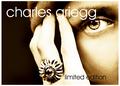
CGby whiteroomComment by bpickard: This is a very professional affair in terms of the composition, toning and text. This could so easily appear on the back of a magazine. Some may complain about the string lighting on the fingers but I think it really adds structure to the image. My only criticism is that, rightly or wrongly ,most jewellery ads tend to err on the side of 'glittery opulence' whereas the ring here is quite flat. High scorer nevertheless. |
| Photographer found comment helpful. |
| 04/29/2005 12:53:18 PM |
Framedby whiteroomComment by shutterfly: I really love the composition here. Great job! I need to learn how to use diffuse glow! |
| Photographer found comment helpful. |
| 04/29/2005 12:26:34 PM |
Framedby whiteroomComment by flip89: One of my tens in the challenge. There is so much infectious joy in this photograph. Congrats on the top twenty finish (but it could have been higher). |
| Photographer found comment helpful. |
| 04/29/2005 08:50:02 AM |
CGby whiteroomComment by shareinnc: Nice high tone shot. Interesting composition which definitely highlights the jewelry as an ad should. Great job. |
| Photographer found comment helpful. |
| 04/29/2005 05:17:10 AM |
CGby whiteroomComment by colda: I really like the image but cannot decide if the blown out highlights are a benefit or not, maybe it would work better if there were no blow outs on the actual ring - there again I cannot imagine how this would look (or work).
Whatever, I like it - well done :) |
| Photographer found comment helpful. |
| 04/29/2005 01:54:45 AM |
CGby whiteroomComment by artvet: one of my two faves in this challenge. i like the colors and composition. i know that text serves the purpose of advertising, but i would love it without any. (10) |
| Photographer found comment helpful. |
| 04/29/2005 01:19:27 AM |
|
| Photographer found comment helpful. |
| 04/29/2005 12:48:12 AM |
CGby whiteroomComment by awpollard: Excellent advertising shot. The tones are wonderful . Well thought out. The whole presentation is very nice. The only thing that I would like to see different is a tad bit more detail on the ring. Possibly if the tones on the hand was closer to the tones of the face would be enough to bring out those edges of the ring that seem to disappear. Very Good shot. One of my top picks. |
| Photographer found comment helpful. |
| 04/28/2005 11:03:25 PM |
CGby whiteroomComment by magnus: Most creative one so far. Only minor problem is that the bottom of the first 'g' fades into the finger. Still a truly professional looking ad - 8 |
| Photographer found comment helpful. |
Home -
Challenges -
Community -
League -
Photos -
Cameras -
Lenses -
Learn -
Help -
Terms of Use -
Privacy -
Top ^
DPChallenge, and website content and design, Copyright © 2001-2026 Challenging Technologies, LLC.
All digital photo copyrights belong to the photographers and may not be used without permission.
Current Server Time: 06/21/2026 11:55:31 AM EDT.