| Image |
Comment |
| 03/18/2004 08:12:50 PM |
|
 Photographer found comment helpful. Photographer found comment helpful. |
| 03/18/2004 06:52:35 PM |
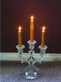
A Light in the Darknessby JadeComment by GinaRothfels: That white line across the photo really detracts from the effect of the picture. A plainer background would have been best, otherwise try shooting from a lower angle or you could try cropping to show just the candles and the top of the candelabra. |
| Photographer found comment helpful. |
| 03/18/2004 12:48:07 PM |
|
| Photographer found comment helpful. |
| 03/17/2004 06:11:49 PM |
A Light in the Darknessby JadeComment by justine: Okay I see what you are trying to show here. However this falls short. The composition is too complicated. A candle stick on the floor with three different backgrounds is just too busy for this plain glass candle holder. It really is pretty and would of looked much better with something more simple. |
| Photographer found comment helpful. |
| 03/17/2004 11:51:34 AM |
A Light in the Darknessby JadeComment by admart01: creative idea - background (baseboard) detracts as I find that parallel line breaks up your image and draws my attentin from the subject |
| Photographer found comment helpful. |
| 03/17/2004 11:43:32 AM |
|
| 03/17/2004 08:49:31 AM |
A Light in the Darknessby JadeComment by Tallbloke: Why didnt you get down level with the candelabrum and set it in front of a plain background (no skirting board). That would have transformed a mediocre picture inta a better photo. (Just my opinion) The flames are lovely. |
| Photographer found comment helpful. |
| 03/17/2004 04:27:41 AM |
A Light in the Darknessby JadeComment by Sammie: Very pretty picture. It's a lovely still life. I think it would have been better against a solid black background. Then it would have been wonderfully striking. This is a great picture. |
| Photographer found comment helpful. |
| 03/07/2004 07:28:50 AM |
Silence for the Saviorby JadeComment by budokan: No messing around in this shot. Refreshingly bold approach to the challenge - not my favourite pic but high mark for the haunting title and evocative photo.
Could have been a little better composed - (cross not quite straight and too far right. |
| 03/07/2004 02:51:06 AM |
|
Home -
Challenges -
Community -
League -
Photos -
Cameras -
Lenses -
Learn -
Help -
Terms of Use -
Privacy -
Top ^
DPChallenge, and website content and design, Copyright © 2001-2026 Challenging Technologies, LLC.
All digital photo copyrights belong to the photographers and may not be used without permission.
Current Server Time: 07/16/2026 08:09:58 PM EDT.