| Image |
Comment |
| 04/16/2011 12:11:27 PM |
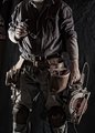
working blues by BrennanOBComment by BrennanOB: Originally posted by SEG:
Good image but I am surprised that no one has mentioned the Staples box and what appears to be PVC pipe in the upper left hand corner where it appears your backdrop is not giving proper coverage. That is usually a detail that DPC would rip you a new one about. Congrats on your blue. |
Frankly so was I. Part of the reason I de-satted the reds so hard was that the diagonal of red from staples box to plyer handles to saw blade, were too strong, and really dominated the composition. The idea was glasses and office supplies, pen in pocket- the business end of the business, upper left, construction part lower right. Im not sure how obvious that metaphor was, but its attempt looked bad enough that I covered up the office supplies and put away the glasses for the rest of the takes. On review is shot was the most interesting, though my daughter said the glasses made me look wimpy, and I find the office and plumbing stuff distracting. Message edited by author 2011-04-16 17:56:04. |
| 04/16/2011 12:02:05 PM |
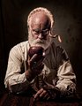
non allegorical image #7 by BrennanOBComment by tanguera: Oh goodness, you're such a FABULOUS model, too!!!! Congrats on your well-deserved ribbon.
BTW, although I didn't notice it in voting, I too would suggest at least cloning out the wedding ring. Seems odd in the context. Although the more I think of it, perhaps it's a clever, subliminal idea! |
 Photographer found comment helpful. Photographer found comment helpful. |
| 04/16/2011 11:56:12 AM |
_MG_4247-eby BrennanOBComment by tanguera: Although the apple here is perfect, it's nowhere near the same league as the one you entered. |
| Photographer found comment helpful. |
| 04/16/2011 08:40:08 AM |
_MG_4247-eby BrennanOBComment by Alicia: The one you submitted is much more powerful. It's purposefully composed and as such has a big impact. That said, this is awesome, as well. |
| Photographer found comment helpful. |
| 04/16/2011 12:18:00 AM |
_MG_4247-eby BrennanOBComment by scooter97: I think this one has more immediate impact. The challenge entry is cool to look at and makes you think a bit more though (perhaps because of the OOF apple). I voted 10 on your entry so I couldn't have improved your score if you had submitted this one instead. Both are awesome images. |
| Photographer found comment helpful. |
| 04/15/2011 10:22:03 PM |
|
| Photographer found comment helpful. |
| 04/15/2011 07:30:25 PM |
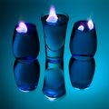
the Andromeda cureby BrennanOBComment by wbanning: Hmmm... I really like the color palette, the reflection, the composition... but something about the relative intensity and softness of texture in the flame seems out of place with the rest of the image. Still like it a lot though. |
| Photographer found comment helpful. |
| 04/15/2011 03:39:19 PM |
|
| Photographer found comment helpful. |
| 04/15/2011 02:02:37 PM |
_MG_4247-eby BrennanOBComment by PenelopeK: I see that in the "outtakes" thread the opinion goes the other way (N=2 there as it does here). I still prefer this one, but the margin of preference has shrunk a little. ! |
| Photographer found comment helpful. |
| 04/15/2011 12:16:28 PM |
|
| Photographer found comment helpful. |
Home -
Challenges -
Community -
League -
Photos -
Cameras -
Lenses -
Learn -
Help -
Terms of Use -
Privacy -
Top ^
DPChallenge, and website content and design, Copyright © 2001-2026 Challenging Technologies, LLC.
All digital photo copyrights belong to the photographers and may not be used without permission.
Current Server Time: 07/23/2026 11:38:15 PM EDT.