| Image |
Comment |
| 08/26/2014 08:13:29 AM |
~ Morning Sunshine ~by KMcCComment by Mike: Critique Club Review:
Color Saturation and Hue: Colors are realistic
Brightness and contrast: image is mostly well lit, love the spot lighting on the subjects
Focus and depth of field: clean and sharp
nice clean sharp image, not much to critique negatively, its well done. |
 Photographer found comment helpful. Photographer found comment helpful. |
| 08/26/2014 08:08:30 AM |
Because you'd like to remember what happened?by KMcCComment by Mike: Critique Club Review:
Color Saturation and Hue: Colors are realistic
Brightness and contrast: the image is a bit dark
Focus and depth of field: the image is clean and sharp
im not sure i get the message (is that a ring) the distortion is a nice touch but the image overall suffer from a unclear message. |
| Photographer found comment helpful. |
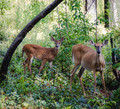
| 08/26/2014 08:02:49 AM |
Spotted!by KMcCComment by Mike: Critique Club Review:
Color Saturation and Hue: Colors are not realistic, but do work very well with this composition.
Brightness and contrast: seems the highlights have been pulled way down and there is a lack of contrast
Focus and depth of field: the deer appear a bit soft but that could be part of the processing
overall its a nice image, its doens't overly appeal to my tastes but you captured a nice moment. |
| Photographer found comment helpful. |
| 08/25/2014 09:49:15 PM |
~ faded rose from days gone by ~by KMcCComment by Mike: critique club:
really nice shot, clean, sharp, nice subdued colors, you could print this out and hang it on a wall. i dont have any advice on improving it... sorry :) |
| Photographer found comment helpful. |
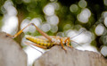
| 08/25/2014 09:40:30 PM |
V I S I T O Rby KMcCComment by Mike: critique club:
i do like this alot but i think it suffer from a poorly chosen crop more than anything, maybe center the insect and go with a wider ratio? |
| Photographer found comment helpful. |
| 08/25/2014 12:56:44 PM |
~morning catch~by KMcCComment by Jules1x: It is my pleasure to critique this image as part of the critique club.
This is a pretty image. I like the delicate colors in the clouds, colors that are reflected in the water on the sand. The lone person makes this image special, and I love seeing his shadow.
There is a fair amount of negative space in this photo, but to me it works in this shot as there is a bit of movement in the clouds, some pattern to the sand, and that nice shadow in the foreground. The subject's pose is a bit closed in, and he is quite far to the right in the image. Although I think for this shot that far right position works, it gave something that drew my eye through the whole image.
I think the muted colors are perfect, I do not think I would enjoy this image as much were the colors more vibrant. The sun is quite bright, and the reflection of the sun in the sand led to two very bright spots right next to the subject. Those bright spots in the sand distracted just a bit. But your high score indicates that few voters found this bothersome. Indeed your high score indicates that other too found this a nice image. |
| Photographer found comment helpful. |
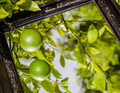
| 08/25/2014 12:20:52 PM |
When life hands you limes...by KMcCComment by Mike: critique club:
i find it interesting to look at, im not sure what it says to me though. the image feels a bit heavily weighted to the top as you kind of lose the border the frame provides on the bottom. its clean and sharp, the highlight on the limes are a bit hot but otherwise well exposed.. |
| Photographer found comment helpful. |
| 08/25/2014 12:06:07 PM |
Why did the gator cross the road?by KMcCComment by Mike: critique club:
i would have liked to see a wider crop and the image is off balance, the isnt enough negative space on the right to balance the left side. |
| Photographer found comment helpful. |
| 08/25/2014 11:56:53 AM |
Light Seekerby KMcCComment by Mike: critique club:
i really like the way this bends on the right adding more interest and leading the eye away from the monotony of the pattern.
possibly put the main stem on a third line intersection its seems a bit too far toward the bottom and may balance the image better. |
| Photographer found comment helpful. |
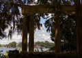
| 08/25/2014 08:58:34 AM |
Framing the viewby KMcCComment by Pangurban: I love the overall photograph but I'm split on this as a challenge entry....It's clear that the structure is framing the buildings, but I'm not sure it either truly isolates or accentuates them |
| Photographer found comment helpful. |
Home -
Challenges -
Community -
League -
Photos -
Cameras -
Lenses -
Learn -
Help -
Terms of Use -
Privacy -
Top ^
DPChallenge, and website content and design, Copyright © 2001-2026 Challenging Technologies, LLC.
All digital photo copyrights belong to the photographers and may not be used without permission.
Current Server Time: 06/22/2026 07:28:28 AM EDT.