| Image |
Comment |
| 09/01/2014 10:13:01 AM |
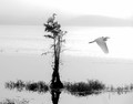
~l o o k o u t~by KMcCComment by hiltonmd: Very nicely done, from the framing to the softness. Love the dramatic affect of black and white. |
 Photographer found comment helpful. Photographer found comment helpful. |
| 08/30/2014 03:03:44 AM |
|
| Photographer found comment helpful. |
| 08/29/2014 10:13:07 PM |
~i want to go home~by KMcCComment by jgirl57: already voted-
This looks like a plantation in the south.. these areas are just beautiful and it seems you brought one out.. almost looks like a painting |
| Photographer found comment helpful. |
| 08/28/2014 09:06:16 AM |
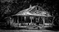
All is lost.by KMcCComment by JakeKurdsjuk: Critique Club:
Well, this is interesting since I've drawn this to critique and already left a comment during the voting, so I'll expound on that.
Composition is OK. I find it interesting that you compressed the crop top-to-bottom. I mentioned the vignetting feels tight and perhaps more room above and/or below would have eased that. Original lighting looks to have been rather harsh, and your high contrast treatment doesn't necessarily help with that.
There's a lot of debris across the roof and on the porch, but there's also a lot along the side of the house hidden in the shadows. Softening the contrast might have helped you show a bit of that as well. As I mentioned, there's also an overtly bright spot on the roof (bare alluminium?) that draws the eye immediately - but there's nothing there. All this goes to say that there's no real subject here for the eye to be drawn to. I suspect you mean it to be the house, and if so, show the whole thing. Pull the shadows out on the side, burn in the roof a bit and get some evenness to the light. Then burn in the area in front of the house and the highlights in the trees and make the whole thing pop.
All that said, there's still a lot going on with the place and to show it in a way that makes you feel it and see it will take some work, particularly in a B&W conversion. Greyscale can make a lot of elements of different colors blend together, so you need to be careful with this and use a tool that allows you to adjust the sensitivity of your various colors in the greyscale image to get the definition you need.
Spending the time with this image you could have, as I said before, earned a lot better than the 5 I gave you initially, and the 6 that you averaged.
|
| Photographer found comment helpful. |
| 08/27/2014 03:22:45 AM |
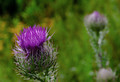
Prickly Purpleby KMcCComment by wbanning: Critique Club Commentary:
On initial impression, I'm attracted by the detail and color of the front flower and the mirroring of the blurred secondary background subject.
On further viewing, I'm seeing good detail, focus and dynamic range in the front flower, but I become slightly distracted by the darkness in the upper left corner and the splashes of yellow behind the front flower.
Compositionally, the strong diagonal line created between the flowers draws my attention appropriately between the foreground subject and the mirrored background subject. I'd like to see a bit further down the stem of the foreground subject, which seems to be sitting right on the bottom edge of the image. Finally, the distance between the two subjects may be a bit extreme, with a tendency to push both subjects too far toward the corners.
The light is fairly soft and provides even coverage, but seems a bit flat - perhaps in need of more contrast/highlights.
Overall it is an appealing image that succeeds on first impression and provides interest and composition to hold attention and encourage a longer look. Message edited by author 2014-08-28 19:48:14. |
| Photographer found comment helpful. |
| 08/26/2014 08:12:19 PM |
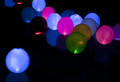
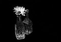
You don't bring me flowers...anymore.by KMcCComment by wbanning: Hi Kimberly!
I'm here as a new Critique Club member... Your image popped up as my first opportunity to do a critique. Here goes:
First off, I'm always drawn to B&W images of flowers, as they can, at times surprisingly, depict the inherent beauty of a subject that typically uses color as a primary component of attraction, as this photo does. It presents a strong first impression. The dramatic contrast and abundant use of negative space really draws me in as a viewer. The off-center composition is effective as well and creates a powerful isolation of the subject - which is amplified by your choice of title. The patterns and contrast of the cut glass create a combined balance and tension for me. I like the mirroring of the flower with the radial pattern on the bottle directly below it, although, I'm struggling a bit with splitting my attention between the two - not really sure where to focus.
The amount of grain/noise is interesting, too. While it adds an interesting dimension to the texture of the flower, it also draws my attention to the portions of the petals that are blown out to pure white. This texture in the flowers, and to a lesser degree in the glass, also contrasts with the smooth noiseless background black in a way that separates the subject from the background.
Let me finish by going back to that all important first impression. My voting typically starts with a separation of entries that immediately catch my attention and those that don't (6's vs 5's). I then revisit the 6's for a closer look and boost the score when a more detailed observation draws me in further to the image. I did vote in this challenge and gave your photo a 6. It caught my eye as a strong entry and I remain impressed with the overall dramatic impact.
Bill Banning
Critique Club |
| Photographer found comment helpful. |
| 08/26/2014 06:59:11 PM |
|
| Photographer found comment helpful. |
| 08/26/2014 06:02:47 PM |
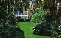
Framing the viewby KMcCComment by Catherine_B: Beautiful use of framing, I just wish there was something more interesting on the other side of the frame.... This ends up looking like an empty frame to me as the house on the other side of the water isn't anything special. |
| Photographer found comment helpful. |
| 08/26/2014 09:38:23 AM |
A New Day Risingby KMcCComment by Mike: critique club:
colors and saturation: color are very realistic
focus and depth of field: sharp clean focus
composition: try to move the horizon down or up third part of the image so the image favors either the sky or ground usually results in more appealing images.
overall: the sky is very noisy and there is a lot of color artifacting going on. otherwise great colors and atmosphere. |
| Photographer found comment helpful. |
| 08/26/2014 09:14:58 AM |
|
| Photographer found comment helpful. |
Home -
Challenges -
Community -
League -
Photos -
Cameras -
Lenses -
Learn -
Help -
Terms of Use -
Privacy -
Top ^
DPChallenge, and website content and design, Copyright © 2001-2026 Challenging Technologies, LLC.
All digital photo copyrights belong to the photographers and may not be used without permission.
Current Server Time: 06/22/2026 02:59:47 PM EDT.