|
|
|
Showing 2311 - 2320 of ~4392 |
| Image |
Comment |
| 11/17/2005 03:23:23 AM | |
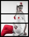
| 11/16/2005 03:41:27 PM | Objectifiedby labudsComment by Elaine: This seems to be divided just to meet the challenge, and I find the black very distracting. It might have been better to have a 1 or 2 pixel border around each panel and have the background white. |
| 11/15/2005 07:08:35 PM | Objectifiedby labudsComment by kiwiness: This is good, the reds and the whites together wow! The quality of the photo is also awesome, but what gets me, and what doesn't do this image justice is the thick black borders you chose. I would have reduced them a lot thinner, to at least a third of the size. For me they borders are taking too much away from the photo. |
| 11/15/2005 06:50:09 PM | Objectifiedby labudsComment by Philos: Why do I get the feeling that I know who shot this.
I will look it up after the challenge, i've been wrong before so I am not telling names anymore ;)
Very nice, and, I am not a fan of selective (de)saturation, because mostly it serves no purpose or doesn't do the pic any good, but here, well, uhm, it does. |
| 11/15/2005 04:47:20 PM | Objectifiedby labudsComment by DrAchoo: Sexy, but tasteful. The triptych works in that it "objectifies" the woman into head, breasts, legs. Subtle. 8 |
| 11/15/2005 04:22:37 PM | Objectifiedby labudsComment by mesmeraj: This is a really nice glam shot, good use of selective desat, love the expression on the models face. But imho it doesn't really work. Yes you have made it into a triptych by dividing the image into 3 panels, but it simpley does not make sense as a triptych. The boarders are taking away from a perfectly great image. |
| 11/15/2005 03:34:16 PM | Objectifiedby labudsComment by Antanas: OK, real nurses does not wear these red things, but I would lie telling I don't like this tryptich. Moreover, I find it compositionwise very sound - dividing picture into three self-containing parts and joining them in single frame is exactly how I understand tryptich. At least one of possible variations. Technically it is also very good - red color definition, shades of white. Content is a bit provoking, but it adds to picture too...10 |
| 11/15/2005 12:44:36 PM | |
| 11/15/2005 12:36:10 PM | |
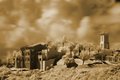
| 11/15/2005 12:35:08 PM | Old San Juan Cemeteryby labudsComment by Cutter: oh my. I like this. So many parallels. Death/Life. Beauty/Corrosion. But best of all it like it because it shows me a part of the world I have not laid eyes on, and effectively at that. |
|
Showing 2311 - 2320 of ~4392 |
Home -
Challenges -
Community -
League -
Photos -
Cameras -
Lenses -
Learn -
Help -
Terms of Use -
Privacy -
Top ^
DPChallenge, and website content and design, Copyright © 2001-2026 Challenging Technologies, LLC.
All digital photo copyrights belong to the photographers and may not be used without permission.
Current Server Time: 04/16/2026 10:12:50 AM EDT.
|