| Image |
Comment |
| 09/21/2005 05:08:56 PM |
Raineby JutildaComment by yasemina: look at that cute little hand defying the world..and that wonderful expression she has in her eyes...oh what a beauty.. |
 Photographer found comment helpful. Photographer found comment helpful. |
| 09/21/2005 05:03:56 PM |
|
| 09/21/2005 05:01:23 PM |
|
| Photographer found comment helpful. |
| 09/21/2005 04:16:25 PM |
Starkby JutildaComment by KarenNfld: I guess you were going for a high-key image but the petals are not in focus, the leaves are. I also don't think it fits the theme. |
| Photographer found comment helpful. |
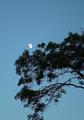
| 09/21/2005 02:04:18 PM |
Catch the Moonby JutildaComment by puzzled: I think this was a very good entry, Judy. I didn't vote this time around, but wish I had (it would've been a much higher vote than your average score here). I like the composition and the simplicity very much. The tree looks like it's just waiting there for the sake of catching that moon. Nice. |
| 09/21/2005 02:00:57 PM |
Catch the Moonby JutildaComment by puzzled: oops, I said basically the same thing twice. Must've been when the site was misbehaving :-) Message edited by author 2005-10-04 00:52:35. |
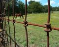
| 09/21/2005 01:22:48 PM |
Texasby JutildaComment by Tammer: I like the idea and how you framed the horse in the one square without cutting him (or her) off. |
| Photographer found comment helpful. |
| 09/21/2005 12:53:21 PM |
Fade to Blackby JutildaComment by CalliopeKel: I fiddled with it in photoshop (from the above copy, not original) and took Librodos suggestions, not sure if its anymore to anyones liking though.
 |
| Photographer found comment helpful. |
| 09/21/2005 08:58:21 AM |
Starkby JutildaComment by CalliopeKel: Wow this is very different! I love the the color tones and the stark background. Rightly named. Interesting choice of Thirds. I love it. |
| Photographer found comment helpful. |
| 09/21/2005 07:40:26 AM |
Fade to Blackby JutildaComment by librodo: Hi Judy. This is a good portrait. Too much glow, yes, I agree. It doesn't suit your subject. Also, it is a bit too centered.
Anyway, I would suggest a more radical approach. With picture you have now, lower down the contrast through curves and add some noise. Also, play around with the selective colors. This is a good photo but could be even better. This should have been in the 6.5 range... JMHO. |
| Photographer found comment helpful. |
Home -
Challenges -
Community -
League -
Photos -
Cameras -
Lenses -
Learn -
Help -
Terms of Use -
Privacy -
Top ^
DPChallenge, and website content and design, Copyright © 2001-2026 Challenging Technologies, LLC.
All digital photo copyrights belong to the photographers and may not be used without permission.
Current Server Time: 05/01/2026 08:31:17 AM EDT.