| Image |
Comment |
| 04/14/2004 04:23:25 PM |
|
 Photographer found comment helpful. Photographer found comment helpful. |
| 03/08/2004 10:01:05 PM |
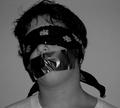
Lost Hopeby DsealeComment by boomer: I don't understand the title and it's connection to the photo. Image is flat and rather static. the subject doesn't appear to care much about what's happening. With nothing in the background to give us clues, I don't understand why he/she? is blindfolded and wearing tape over his/her mouth... |
| Photographer found comment helpful. |
| 03/05/2004 11:52:21 AM |
Lost Hopeby DsealeComment by amsmyth: doesn't really say a whole lot and the flash on the duck tape is unfortunate |
| Photographer found comment helpful. |
| 03/04/2004 01:37:33 PM |
Lost Hopeby DsealeComment by gpierson: shot is uninteresting, a hostage/kidnapping seems dramatic, would like to see your image convey the drama a little better. |
| Photographer found comment helpful. |
| 03/04/2004 10:34:21 AM |
Lost Hopeby DsealeComment by blueswolf58: Yeah, I know the feeling.... I wake up feeling JUST like this on Mondays. The tape seems to be doing all the talking in these photos, wish there was more to look at. Lighing is rather flat, could use more directional lighting for better modelling (highlights, midtones, shadows). |
| Photographer found comment helpful. |
| 03/03/2004 12:22:31 AM |
|
| Photographer found comment helpful. |
| 02/24/2004 03:39:55 PM |
|
| Photographer found comment helpful. |
| 02/24/2004 03:29:23 PM |
|
| Photographer found comment helpful. |
| 02/23/2004 10:27:16 AM |
|
| Photographer found comment helpful. |
| 02/23/2004 06:37:59 AM |
|
| Photographer found comment helpful. |
Home -
Challenges -
Community -
League -
Photos -
Cameras -
Lenses -
Learn -
Help -
Terms of Use -
Privacy -
Top ^
DPChallenge, and website content and design, Copyright © 2001-2026 Challenging Technologies, LLC.
All digital photo copyrights belong to the photographers and may not be used without permission.
Current Server Time: 05/07/2026 12:17:09 AM EDT.