| Image |
Comment |
| 02/18/2004 01:41:30 PM |
|
| 02/18/2004 09:40:44 AM |
Textures of Musicby deegeComment by e301: Don't understand why this is in this challenge - even were it in focus (and there's no reason, with this kind of event, that it has to be) I don't see that there would be any texture here, not really. Your title encourages me to see a 'different' kind of texture, I think - but I'm afraid I think that is not the point. |
| 02/18/2004 09:27:57 AM |
Textures of Musicby deegeComment by EL-ROI: It's blurry, It's dark, and it's far away from the subject.
You're just really showing off about the fact you went to a concert! |
| 02/18/2004 08:30:43 AM |
Textures of Musicby deegeComment by soccerdad: I like the silouette frame and the color, but I would have worked very hard on improving the focus of the musicians. Please note: this might just be me, I never seem to like soft focus (on anything.) |
| 02/18/2004 06:35:58 AM |
|
| 02/18/2004 04:43:08 AM |
|
| 02/18/2004 01:57:33 AM |
|
| 02/02/2004 11:27:46 AM |
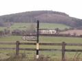
Antiqueby deegeComment by Harz_Joerg: Greetings from the Critique Club
Initial thoughts/My opinion
Great antique road signs! Too bad technically it's not too well executed.
Content/Composition
The content of the image is very well chosen and showing not only the old sign but also some of the surrounding landscape was a wise choice IMO. You might have composed the image a little different by either placing the sign more to the left or right or maybe even center it. The way it is now, it's a little indifferent. I would have placed it according to the nicer background.
Camera work -technically
The focus seems more or less fine, although I do not want to call the image sharp. Exposure could be a bit darker. Everything looks pale.
Digital Processing - Technical
I think that via post processing the image could have been made much better.
B&W or sepia might have been a wise choice, especially for strengthening the antique feeling. A bit more contrast as well as adjusting the brightness might have been good too. Another step of improvement would have been sharpening the image a bit more and maybe (that's a matter of taste) add some noise/grain to it to make it look even more old. You should also have rotated the image CCW to make the sign post vertical.
Fits the challenge
Yes, it does so very well.
Good luck for your upcoming submissions
|
| 01/27/2004 11:14:19 PM |
Antiqueby deegeComment by Rasai: I would like it with a little more saturation and contrast. |
| 01/27/2004 01:16:27 PM |
Antiqueby deegeComment by jenesis: This is a very pretty shot. My only complaints are it's a little blurry and a little washed out. But pretty nonetheless. |
Home -
Challenges -
Community -
League -
Photos -
Cameras -
Lenses -
Learn -
Help -
Terms of Use -
Privacy -
Top ^
DPChallenge, and website content and design, Copyright © 2001-2026 Challenging Technologies, LLC.
All digital photo copyrights belong to the photographers and may not be used without permission.
Current Server Time: 07/16/2026 01:01:24 AM EDT.