| Image |
Comment |
| 11/18/2006 01:00:35 PM |
|
 Photographer found comment helpful. Photographer found comment helpful. |
| 11/18/2006 01:58:25 AM |
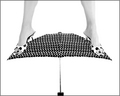
Well Balanced by idnicComment by Qart: What a cool idea for the challenge. Very crisp and pure and so original. Great job! And i'm back to let you know that you have the clear cut winner in my opinion. Little bump to help you along... Good Luck! |
| Photographer found comment helpful. |
| 11/18/2006 12:50:34 AM |
|
| Photographer found comment helpful. |
| 11/17/2006 09:12:39 PM |
Well Balancedby idnicComment by SandyP: Now THOSE are some interesting spots! I love the mixed prints, and the creative composition! Fantastic photo for this challenge! |
| Photographer found comment helpful. |
| 11/17/2006 04:25:58 PM |
Crashingby idnicComment by kiwiness: Idea is good, composition is good, but the left eye comes over a little too unnaturally for me. |
| Photographer found comment helpful. |
| 11/17/2006 03:16:03 PM |
Well Balancedby idnicComment by justine: Is she hanging from the ceiling? LOL Just super. Love the high-key look. Wonderful take on the challenge!! Well done. One of my top rated for the challenge. |
| Photographer found comment helpful. |
| 11/17/2006 02:43:48 PM |
|
| Photographer found comment helpful. |
| 11/17/2006 01:29:17 PM |
Well Balancedby idnicComment by islandpaddler: Interesting concept and title! But the composition seems just a bit "unbalanced" for my tastes. I think I would like it better if a tad more of the leg was cropped at the top, or if there was more space below the umbrella. |
| Photographer found comment helpful. |
| 11/17/2006 11:31:54 AM |
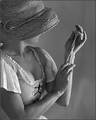
Admiring Her Treasuresby idnicComment by blindjustice: I like this feel; somewhere between a vermeer painting and an antique feeling add for jewelry. I do have some criticisms though, but please take these from the thought that this is still better than mostly anything I've done.
The focus could use some tweeaking; there is som strong focus on the right arm, but also on the hat- the depth of field should be adjusted to compensate, there mightbe more impact if the pearls weren't blurred at the expense of the right arm;
The area where the eye rests is just to the right of the right shoulder. where the lightest spot of the photo is, and its intersection with cleavage. I am all for cleavage, but here, it distracts from all else; I like the lace up bodice type approach to teh outfit, but again, perhaps a focus shift would adjust all the centers of interest.
I do love the tones, values and contrasts, the texture of the hat against the smothness of the background and white against skin; and the quilting below. Also, perhaps a bit of a pull back on the crop would be interesting.
All in all a terrific shot;
|
| Photographer found comment helpful. |
| 11/17/2006 10:58:48 AM |
|
| Photographer found comment helpful. |
Home -
Challenges -
Community -
League -
Photos -
Cameras -
Lenses -
Learn -
Help -
Terms of Use -
Privacy -
Top ^
DPChallenge, and website content and design, Copyright © 2001-2026 Challenging Technologies, LLC.
All digital photo copyrights belong to the photographers and may not be used without permission.
Current Server Time: 07/24/2026 02:24:13 AM EDT.