| Image |
Comment |
| 11/17/2006 04:25:58 PM |
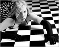
Crashingby idnicComment by kiwiness: Idea is good, composition is good, but the left eye comes over a little too unnaturally for me. |
 Photographer found comment helpful. Photographer found comment helpful. |
| 11/17/2006 03:16:03 PM |
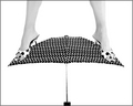
Well Balanced by idnicComment by justine: Is she hanging from the ceiling? LOL Just super. Love the high-key look. Wonderful take on the challenge!! Well done. One of my top rated for the challenge. |
| Photographer found comment helpful. |
| 11/17/2006 02:43:48 PM |
|
| Photographer found comment helpful. |
| 11/17/2006 01:29:17 PM |
Well Balancedby idnicComment by islandpaddler: Interesting concept and title! But the composition seems just a bit "unbalanced" for my tastes. I think I would like it better if a tad more of the leg was cropped at the top, or if there was more space below the umbrella. |
| Photographer found comment helpful. |
| 11/17/2006 11:31:54 AM |
Admiring Her Treasuresby idnicComment by blindjustice: I like this feel; somewhere between a vermeer painting and an antique feeling add for jewelry. I do have some criticisms though, but please take these from the thought that this is still better than mostly anything I've done.
The focus could use some tweeaking; there is som strong focus on the right arm, but also on the hat- the depth of field should be adjusted to compensate, there mightbe more impact if the pearls weren't blurred at the expense of the right arm;
The area where the eye rests is just to the right of the right shoulder. where the lightest spot of the photo is, and its intersection with cleavage. I am all for cleavage, but here, it distracts from all else; I like the lace up bodice type approach to teh outfit, but again, perhaps a focus shift would adjust all the centers of interest.
I do love the tones, values and contrasts, the texture of the hat against the smothness of the background and white against skin; and the quilting below. Also, perhaps a bit of a pull back on the crop would be interesting.
All in all a terrific shot;
|
| Photographer found comment helpful. |
| 11/17/2006 10:58:48 AM |
|
| Photographer found comment helpful. |
| 11/17/2006 10:49:18 AM |
Crashingby idnicComment by UNTITLED: Very cool concept and composition. It would nice if the gloved hands didn't disappear into the black tiles. Some kind of highlighting on the edges or something to create seperation. |
| Photographer found comment helpful. |
| 11/17/2006 10:09:13 AM |
|
| Photographer found comment helpful. |
| 11/17/2006 09:30:12 AM |
|
| Photographer found comment helpful. |
| 11/17/2006 05:27:25 AM |
|
| Photographer found comment helpful. |
Home -
Challenges -
Community -
League -
Photos -
Cameras -
Lenses -
Learn -
Help -
Terms of Use -
Privacy -
Top ^
DPChallenge, and website content and design, Copyright © 2001-2026 Challenging Technologies, LLC.
All digital photo copyrights belong to the photographers and may not be used without permission.
Current Server Time: 07/24/2026 12:13:14 AM EDT.