| Image |
Comment |
| 08/09/2004 12:53:13 AM |
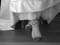
Cold Feetby ccraftComment by JPR: Great image. Should have cropped off the top left. Other than that it's just about perfect. Top 10 for sure. |
 Photographer found comment helpful. Photographer found comment helpful. |
| 06/27/2004 10:36:20 AM |
|
| Photographer found comment helpful. |
| 06/26/2004 10:36:23 PM |
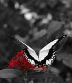
Attractionby ccraftComment by Dave Gordon: First impression: The butterfly should have been in color. Second impression: desaturating the butterfly makes this a spectacular picture, with both selective desaturation and selective DOF giving it tremendous depth. A definite 10. |
| Photographer found comment helpful. |
| 06/26/2004 05:25:43 AM |
Attractionby ccraftComment by Andelain: nice, but i'd have liked to see the butterfly in colour to, Or maybe he aint to colourful? |
| Photographer found comment helpful. |
| 06/25/2004 04:56:14 PM |
|
| Photographer found comment helpful. |
| 06/25/2004 07:38:48 AM |
Attractionby ccraftComment by nordic: I think I would have prefered to see the butterlay in colour, nice image though |
| Photographer found comment helpful. |
| 06/25/2004 05:48:05 AM |
Attractionby ccraftComment by spydr: even with the color left in the flowers, me attention is drawn to the butterfly. great contrast. I would like to see a full b&w version |
| Photographer found comment helpful. |
| 06/24/2004 03:53:03 AM |
Attractionby ccraftComment by hgpayne: I've seen several butterflies in this challenge where everything but the butterfly was desaturated. What is it they are trying to say? Here, you've left the flower with a title of "Attraction." GREAT!!! The title emphasizes the point of the photo. I could see this as a poster with the title printed across the top of the photo in that negative space (I know this is illegal for the challenge -- I'm just making a suggestion for a future print). Great DOF and nicely cropped. Maybe not a winner, but should make top 10 IMHO. |
| Photographer found comment helpful. |
| 06/24/2004 12:11:02 AM |
Attractionby ccraftComment by jab119: very nice. I like the angle of the butterfly in the shot. framing/ cropping is nice also. The butterfly looks real sharp. There looks to be a few hard lines aroud the red flowers that the selection tool missed. Im sure it wil make a very nice print |
| Photographer found comment helpful. |
| 06/23/2004 08:11:14 PM |
Attractionby ccraftComment by Bran-O-Rama: Beautiful photo with the butterfly in sharp focus (at least the top half). Interesting to choose the flowers to be colorized, I would've chosen the butterfly but that's what makes this photo different. Selection of the flowers under the butterfly seems a bit "loose" as parts of the background were left out when desaturating. |
| Photographer found comment helpful. |
Home -
Challenges -
Community -
League -
Photos -
Cameras -
Lenses -
Learn -
Help -
Terms of Use -
Privacy -
Top ^
DPChallenge, and website content and design, Copyright © 2001-2026 Challenging Technologies, LLC.
All digital photo copyrights belong to the photographers and may not be used without permission.
Current Server Time: 07/17/2026 11:53:23 PM EDT.