| Image |
Comment |
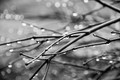
| 02/21/2016 07:45:04 PM |
Dewby HUETHComment by Kodak: Well composed, as an exercise in Macro I would have cropped in a little tighter. |
 Photographer found comment helpful. Photographer found comment helpful. |
| 02/21/2016 03:18:51 PM |
|
| Photographer found comment helpful. |
| 02/18/2016 12:44:41 PM |
|
| 02/17/2016 02:12:55 AM |
|
| Photographer found comment helpful. |
| 02/09/2016 07:44:36 PM |
|
| 02/01/2016 01:01:50 PM |
|
| Photographer found comment helpful. |
| 01/31/2016 08:02:57 PM |
|
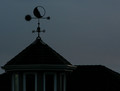
| 01/31/2016 07:05:43 PM |
weathervaneby HUETHComment by Phocal: This is really just a dark photograph. For a silhouette it should be against a bright background and in your case the background is not significantly brighter. |
| Photographer found comment helpful. |
| 01/30/2016 10:13:22 PM |
|
| Photographer found comment helpful. |
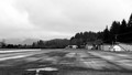
| 01/29/2016 07:36:55 PM |
stormyby HUETHComment by Kodak: Nice atmosphere but watch your histogram. Over exposed in the main focus point. |
| Photographer found comment helpful. |
Home -
Challenges -
Community -
League -
Photos -
Cameras -
Lenses -
Learn -
Help -
Terms of Use -
Privacy -
Top ^
DPChallenge, and website content and design, Copyright © 2001-2026 Challenging Technologies, LLC.
All digital photo copyrights belong to the photographers and may not be used without permission.
Current Server Time: 05/06/2026 12:46:41 AM EDT.