|
|
Comments Received by Mark
|
Showing 411 - 420 of ~960 |
| Image |
Comment |
| 09/28/2005 11:00:57 AM | Skyward Mapleby MarkComment by vtruan: where is the ground? Never mind, I see I as usual interpreted the shot dirrerently that most. |  Photographer found comment helpful. Photographer found comment helpful. |
| 09/27/2005 10:20:00 PM | | | Photographer found comment helpful. |
| 09/27/2005 10:04:12 PM | | | Photographer found comment helpful. |
| 09/27/2005 06:22:20 PM | | | Photographer found comment helpful. |
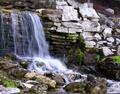
| 09/27/2005 03:13:16 PM | Down to water levelby MarkComment by HBunch: *Critique Club*
Sorry for the delayed critique, I had drawn a couple photos from the list and somehow didn't get to critique them, and just now noticed they weren't done, so here goes...
First off, I think I'm in agreement with the other commenters. The photo hurts my eyes. Really pretty scene, nothing 'jume out of my seat exciting', however, looks relaxing and definately not a place I'd see every day. I think it's the softness that hurts the photo in my opinion. It's not just the water, it seems that the rocks to the right are soft too, and also the rocks to the bottom, so really it's the whole photo. Was this a hand held long exposure? Maybe a little movement that blurred it?
One comment states that a tighter crop would work, and one states that the crop may be too tight chopping off part of the waterfall. Hmmm... I'm going to have to go with tighter crop. I think that by cropping off the tiny section to the left would eliminate any feeling that there was something else to the left. Also, by eliminating the rocks at the bottom of the photo, it brings our view up to the bottom of the waterfall, which is certainly more exciting than the dark rocks at the bottom of the photo.
While I think the green is a very pretty shade. Nice and vibrant, I think that there just isn't enough of it to really help the photo. In otherwords, it creates a random distraction rather than adding to the visual appeal of the photo. Does that make sense?
Lighting appears to be ok, although the mixture of dark objects to light objects just doesn't seem to flow. The photo isn't balanced right. Not really sure what you could do to fix that in a natural setting such as this, (natural in the sense that you can't change it) but it is an observation.
Overall I get the feeling of the location, but I'm not drawn in. ~Heather~ Message edited by author 2005-11-14 01:19:39. | | Photographer found comment helpful. |
| 09/27/2005 03:07:03 PM | The Puppeteerby MarkComment by HBunch: *Critique Club*
Sorry for the late critique, I drew a few critiques, somehow didn't get to critique them, and just realized they were not done, so here goes.
Not really much to say here. Excellent color!! nice crisp lines, focus appears dead on. The strings look a bit jaggy, but I think that's just the texture of the strings. There's a small area in the bottom right corner that is lacking the crisp focus of the rest of the photo, and looking at the photo as a whole, it doesn't affect the photo much in the way of how appealing it is, however, sitting here staring at the image, it does become a bit noticable and somewhat of a distraction.
Nicely done silhouette. I only see one small spot of the lower wrist that was not totally emerged in blackness. Overall a very tiny nit picky detail however.
Placement of the subject is great, I see nothing that needs improving upon.
This is an excellent image, and your score and placing reflect that nicely. Wish I had more to add, but consider that a great compliment.
~Heather~ Message edited by author 2005-11-13 23:44:55. | | Photographer found comment helpful. |
| 09/27/2005 08:02:31 AM | Airborneby MarkComment by Mark: thanks for the critique!
In hindsight, I probably shuld have cropped out the area above the swing, but why I chose not to (I had considered it) was because without any negative space above, it looks like my sister is just going to bump into the top of the frame, dulling the action. I was also afraid that people may not realize that it's a swing if they couldn't tell that it was a beam instead of a wall. |
| 09/27/2005 05:36:40 AM | | | Photographer found comment helpful. |
| 09/27/2005 02:01:14 AM | Airborneby MarkComment by KiwiChris: Hi-ho from the Cirtique Club...
Just reading your comments, and those of the commenters, I think you're being a little hard on yourself. This is a cool photo. It didn't do all that well in the challenge, but the small number of comments tell me that most voters didn't 'get' it rather than thought there were flaws in the image.
It would have been really neat to have the background more out of focus.. As you noted in your comments it's a little busy maybe, but your sisters expression and the big kick to the head more than make up for that!
The exposure is good, with only the small white sky highlights top right distracting my eye from the energy and motion in the shot. The colours are great as well, the strong greens and skintone are pleasing to the eye, with nothing challenging to grasp for the viewer.
The only thing I find disturbing is that the top of the photo is cut off by the frame for the swing. It's almost as if there are two photos here, the one above and the one below. Cropping off the top of the image, keeping most of the wooden framing makes this more balanced to my eye.
I think this image suffered in the voting because people didn't get 'perspective' from the photo. That asside you obviously saw what you wanted, and captured it perfectly. Well done.
Cheers, Chris H. | | Photographer found comment helpful. |
| 09/26/2005 11:18:50 PM | | | Photographer found comment helpful. |
|
Showing 411 - 420 of ~960 |
Home -
Challenges -
Community -
League -
Photos -
Cameras -
Lenses -
Learn -
Help -
Terms of Use -
Privacy -
Top ^
DPChallenge, and website content and design, Copyright © 2001-2026 Challenging Technologies, LLC.
All digital photo copyrights belong to the photographers and may not be used without permission.
Current Server Time: 07/17/2026 07:29:01 AM EDT.
|