| Image |
Comment |
| 05/19/2006 01:41:12 AM |
|
| 05/19/2006 01:14:54 AM |
|
| 05/19/2006 12:25:12 AM |
|
| 05/19/2006 12:13:05 AM |
|
| 05/18/2006 06:56:22 PM |
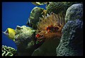
Delightful Pacific Creaturesby nsoroma79Comment by ellamay: Greetings from the CC.
Well, hard for me to know how to comment on this one as I have tried to take aquarium shots and often failed miserably. You however have done a great job. I really like your composition the rocks on the right and the two main and colorful fish swimming in the same direction. I also like that you can feel the movement of the water.
What I do not like is that the rock in the foreground on right is not sharp, and in fact I think the whole image could be slightly sharper. I may have also cropped a tiny bit off the bottom.
Overall a good shot, congrats on your well placed finish,
Lynn |
| 05/14/2006 03:53:19 AM |
Kid Rockby nsoroma79Comment by liltritter: First glance I noticed part of the top of his head is missing... The shot is really great, just for me the missing piece distracts. |
| 05/13/2006 09:16:23 PM |
|
| 05/13/2006 11:10:52 AM |
Beautiful Comtemplationby nsoroma79Comment by Louis: Compositionally a nice picture, and a fine portrait. I like the position of her arms, which kind of brings the viewer around the edges of the photograph in a pleasing way. I think the washed out or blown out area behind her head detracts a little for me. The lighting might have been improved with fill flash to brighten her features somewhat. |
| 05/13/2006 10:53:34 AM |
Camera Shyby nsoroma79Comment by Phil: Greetings from the Critique Club Lorrie!
Abosolute cutie pie of a child. This capture makes you want to squeeze her to death and pinch her cheeks in the process :). Exposure looks to be good and you handled the lighting well. This is a shot that any parent would be proud to hang on their wall.
Even though 6.0211 isn't a bad score at all, why didn't it receive a better one? My opinion would be the vignetting you added. While I certainly like it in this case, it may not appeal to the masses. It's definitely a hit or miss step for DPC. You felt it worked, I feel it worked, but some probably didn't think so. I'd also clone out the little blemish on her arm.
Overall a great shot indeed!
Thank you for the opportunity to critique this image Lorrie.
Cheers - Phil
|
| 05/13/2006 12:13:02 AM |
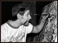
Local Artist paints tribute to Marilyn Monroeby nsoroma79Comment by Makka: * Greetings from the Critique Club *
Hi Lorrie. I thought this was a terrific entry for the Photojournalism II challenge. Well done.
I guess the main question I have for this image is why didn't you use colour? It looks like an amazing painting and it would of been great to see it in all it's glory. Also, the concentration shown on his face is priceless. I would have to disagree with some of the comments you received regarding a different angle to show more. I think the way you've captured this works well as there is a nice balance of his side profile and I think you are showing enough of the painting as well.
The focus seems nice and crisp. There's a bit of nasty shadow under his chin and his left arm which distracts a little. Depending on the building you were in maybe a bit of bounced flash may of worked differently. I really like the crop you have used as you've really filled the frame with your subject.
All up, a really great photo. Keep your photos coming because your portfolio is full of terrific photos. Well done!
Neil |
Home -
Challenges -
Community -
League -
Photos -
Cameras -
Lenses -
Learn -
Help -
Terms of Use -
Privacy -
Top ^
DPChallenge, and website content and design, Copyright © 2001-2026 Challenging Technologies, LLC.
All digital photo copyrights belong to the photographers and may not be used without permission.
Current Server Time: 06/27/2026 02:37:09 AM EDT.