Faceby
belinhaComment by ladyhawk22: [ I]::: Critique Club :::[/i] ladyhawk22
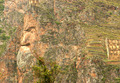
First Impression - the most important one: My first impression is that this is a subtle image, in relation to the challenge theme. An amazing formation in the rock, but one that perhaps has more impact in person than in a photo.
Composition: The composition of this shot is pretty good. I might put the face just ever so slightly more to the right of the frame. That's a quite nitpicky suggestion though :-) Don't really have any issues with the composition of this shot. One other option might be to crop the photo so that the face in the rock is a larger portion of the shot.
Subject: I personally like those shots that show the photographer has a creative and observant eye, which is what this shot tells me. It definitely shows line and shape.
Technical (Colour, focus, and light): Color looks pretty true to life, though for this particular shot I might suggest upping the saturation levels a bit. It's my opinion that more vibrant colors might catch the eye a bit more and may also help accentuate the face in the rock. The natural light looks good in this shot and the focus looks pretty good as well...maybe just a *tad* soft. But it doesn't obscure the subject.
To grow its vote?: I think that perhaps this shot might have been a little out of the box for some voters, though in my opinion it fits the challenge well. Perhaps the key to improving this image lies in the post processing. Some things to try might be different crops, bumping up the saturation, and manipulating the color balance. I might also suggest playing with Levels a bit, and perhaps even trying the shot in Black & White.
Summary: All in all, you did a great job finding this face!! I think it's a great and creative shot that fit the challenge well. Playing around with some of the settings might fine tune this image and make it really pop!