| Image |
Comment |
| 05/22/2002 03:04:00 AM |
|
| 05/20/2002 03:07:00 PM |
Get A Clueby kristie380Comment by Dangerous_blues: I like the use of browns in this photo, well thought out and put together, the only thing I thing might be improved in to soften the light on the board. |
| 05/20/2002 01:47:00 PM |
|
| 05/20/2002 11:00:00 AM |
Get A Clueby kristie380Comment by justine: Love the tone. Composition is okay but very busy...too much going on. I think all the activity takes away from a good shot. |
| 05/20/2002 10:59:00 AM |
Get A Clueby kristie380Comment by Kimbly: Sepia toning is a good idea. I think there is too much glare on the board though, so you can't see it very well. |
| 05/20/2002 10:04:00 AM |
Get A Clueby kristie380Comment by joebar: The huge crease in the middle of the board killed it for me.... Was there no way to crop that out, or rotate the board to avoid that? |
| 05/19/2002 10:58:00 AM |
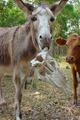
Blaze's Killby kristie380Comment by Yellowpeep: I like the composition of this photo a lot (especially the cow looking at the carnage). It's a bit of a stretch for me in the "upside-down" category. |
| 05/18/2002 09:00:00 PM |
|
| 05/18/2002 07:38:00 AM |
|
| 05/17/2002 09:24:00 AM |
Blaze's Killby kristie380Comment by Patella: that little bit of white in the near eye makes him(?) seem crazy -- well, that and the skull hanging out of his mouth... Composition works well for me. The levels -- especially of the main subject and skull -- seem a little flat and washed out. Maybe bump up the highlights a bit, and the midtones down? Personal pref. |
Home -
Challenges -
Community -
League -
Photos -
Cameras -
Lenses -
Learn -
Help -
Terms of Use -
Privacy -
Top ^
DPChallenge, and website content and design, Copyright © 2001-2026 Challenging Technologies, LLC.
All digital photo copyrights belong to the photographers and may not be used without permission.
Current Server Time: 07/16/2026 12:06:54 PM EDT.