| Image |
Comment |
| 12/30/2003 09:24:50 PM |
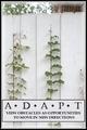
ADAPTby RonBComment by blindjustice: Nice- maybe a little much with the phrase under adapt. That word alone speaks volumes- I love the green on white you have going on here. You must be in a warm and sunny place! I don't like the feathered border. |
 Photographer found comment helpful. Photographer found comment helpful. |
| 12/30/2003 02:52:38 PM |
ADAPTby RonBComment by Dave Gordon: Interesting idea, and an interesting illustration. Is there a reason that one plant is going around obstacles and the other is managing to grow straight up? |
| Photographer found comment helpful. |
| 12/30/2003 02:40:40 AM |
ADAPTby RonBComment by librodo: Great concept. I wish the text are a bit smaller though (just my opinion). |
| Photographer found comment helpful. |
| 12/29/2003 02:13:50 PM |
ADAPTby RonBComment by justine: Nicely done. I like all the white and the text. Not sure why the banner is raised..but it's okay. I think the green could of had a saturation boost. ?just my opinion. |
| Photographer found comment helpful. |
| 12/29/2003 08:03:30 AM |
ADAPTby RonBComment by willem: So simple, so strong. Good choice to use white as background for text. |
| Photographer found comment helpful. |
| 12/29/2003 06:47:15 AM |
ADAPTby RonBComment by kaycee: Good idea. The borders bother me, though, as does the top of the fence (not quite horizontal) |
| Photographer found comment helpful. |
| 12/29/2003 04:50:42 AM |
ADAPTby RonBComment by timmi: Nice concept and shot. Fits perfectly with the challenge and with the text. But I would have put the text completely to the bottom of the poster. This way it kind of floats. Also the border is somehow not fitting with this image, either have a soft border or a hard one. Combining both creates unbalance to me. |
| Photographer found comment helpful. |
| 12/27/2003 09:29:55 PM |
|
| 12/23/2003 11:19:16 AM |
|
| Photographer found comment helpful. |
| 12/22/2003 10:26:27 AM |
|
| Photographer found comment helpful. |
Home -
Challenges -
Community -
League -
Photos -
Cameras -
Lenses -
Learn -
Help -
Terms of Use -
Privacy -
Top ^
DPChallenge, and website content and design, Copyright © 2001-2026 Challenging Technologies, LLC.
All digital photo copyrights belong to the photographers and may not be used without permission.
Current Server Time: 07/16/2026 01:14:43 AM EDT.